K-TOTEM design by Louis Heeren
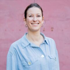
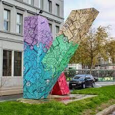
This time, the new K-TOTEM design was created by Howest Digital Design and Development (Devine) student Louis Heeren. The study programme launched a competition among its students, which the third-year student won convincingly. In addition to his studies, Louis has his own company: Huis Heeren. In it, he combines print design and digital design for various clients.
https://www.facebook.com/HuisHeeren/
https://www.instagram.com/huisheeren/
linkedin.com/in/louis-heerenhuisheeren@gmail.com
Describe your K-TOTEM design
"As a student of Digital Design & Development, my life largely consists of spending time on digital screens, digital media, and other digital things. Spending too much time with digital products can easily cause chaos and unrest, which was the theme of this design. Throughout the design, you see an enormous number of products mixed up together in a rather untidy way. This symbolises the overload of digital media and products, which we as humans have to deal with in abundance in this digital age. Abstract forms of plants can also be found in the design. These represent the greenery that we should seek out more in order to relax. Finally, the calendars are more striking because of the white colour they were given, as they refer to the days and hours that fly by when we spend too much time on our digital media."
Where do you draw inspiration from?
"I get a lot of inspiration from music. When I start a graphic assignment, I always look for the matching genre. So I play Dance or Hip Hop when the design is for a party, or Jazz when it's an invitation to a more sober event. In order to achieve the chaotic design of the K-Totem, I played all genres together. I also draw a lot of inspiration from my own surroundings. This can be nature, buildings, but also smaller things like the neon lighting at the night shop."
Which assignment are you most proud of?
"Through the status of student-entrepreneur, I have my own "company" where I have already completed various graphic design assignments as a freelance Graphic Designer. But it is difficult to choose just one. I'm just happy that I get the chance to work on these assignments and hope to expand this later on."
Which illustrators do you look up to?
"For this design I was inspired by the fantastic work of Mauro Martins, an illustrator from Brazil. Some other names are Tim Kuilder, Musketon (off course), Vexx, etc.
I also follow a lot of 3D artists like Rik Oostenbroek, Peter Tarka, BEEPLE, Fran Rossi, and so on. The work they design is so beautiful that now I'm exploring 3D design myself."
What do you think is the most beautiful place in Kortrijk?
"I think the roof terrace of the Budafabriek is always a wonderful place to unwind between lessons and many tasks. Especially during spring and summer, this is a place to enjoy the sunshine and the view of Kortrijk."

