Commerce Design Kortrijk Award
With the Commerce Design Kortrijk Award, the City of Kortrijk and Designregio Kortrijk put creative and innovative businesses and designers in the spotlight. For the 2nd edition, 15 businesses were selected.
Cast your vote for your favourite project now!
The winner will be announced on Tuesday 25 October.


"Commerce Design" is an award programme developed in Montréal, one of the partner cities of the city of Kortrijk in the UNESCO network.
With Commerce Design Kortrijk, we want to show that design-oriented or commercial adaptations to shops not only have a positive impact on the shop itself, but also on the entire neighbourhood and even city and region.
We want to reward these efforts and put our creative and innovative Kortrijk businesses and designers in the spotlight.
Cast your vote
15 trade businesses were selected by the jury to enter the Commerce Design Kortrijk Award competition. They now have a chance to win the Jury Grand Prize and the Public Choice Award. This public prize will be awarded to the project that can secure the most votes between 29 September and 20 October.Below you can click on a merchant for more info and photos. From there, you can then cast your vote for your favourite project!




V-chocolatier by sweertvaeger
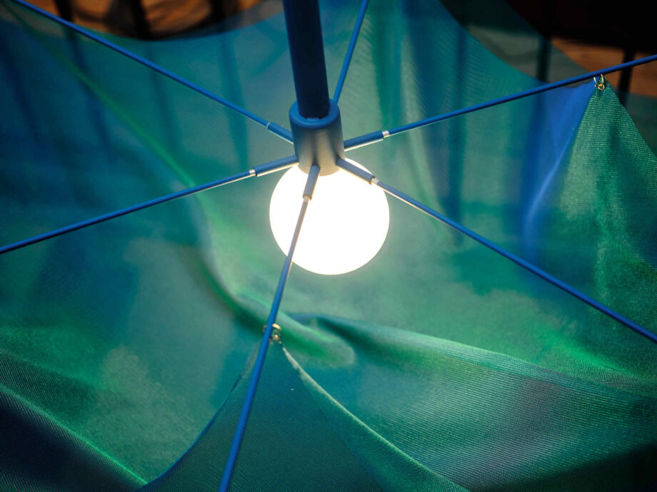
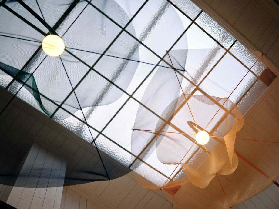
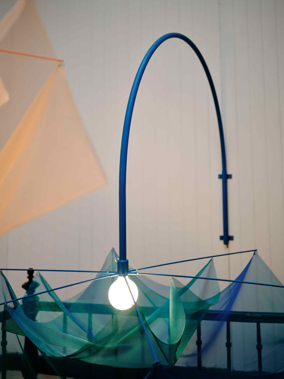
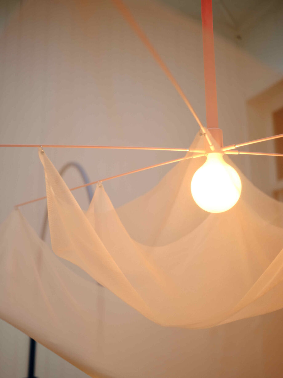
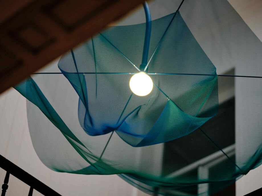
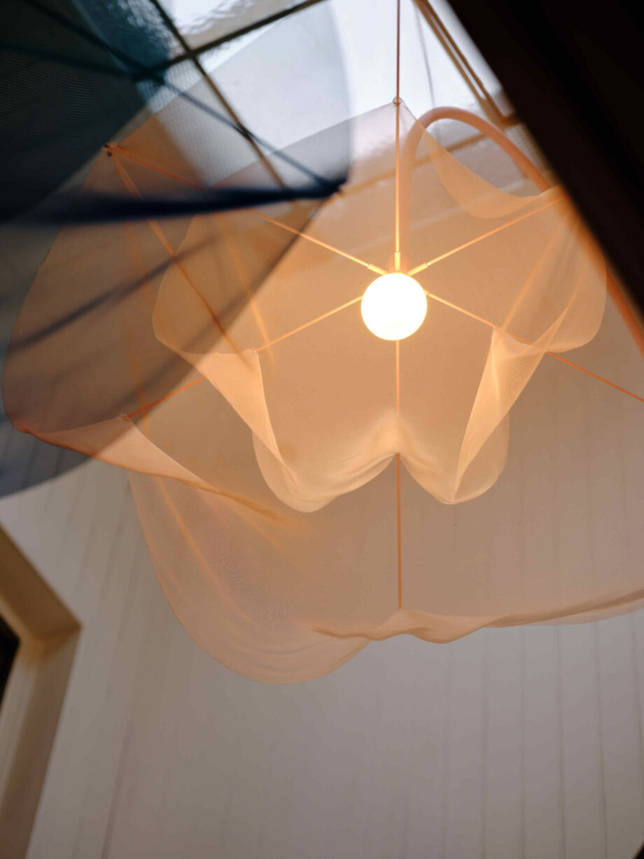
Sweertvaegher is known far and wide for their delicious sweets. Chocolate lovers now have another reason to pop in: thanks to Bling Studio, the shop, with its mezzanine on the first floor, gained a very special crowd puller.
Since not enough light enters the building in gloomy weather, Bling Studio created a creative installation around the void, integrating lighting elements. This simple and poetic intervention brings in not only light but also art and creativity. Shopping and tasting in this chocolate shop thus becomes even more of an overall experience.
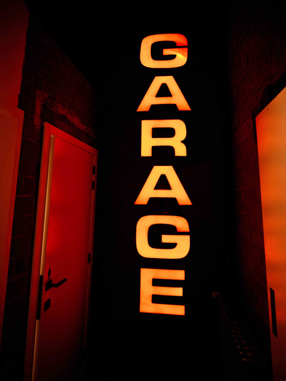
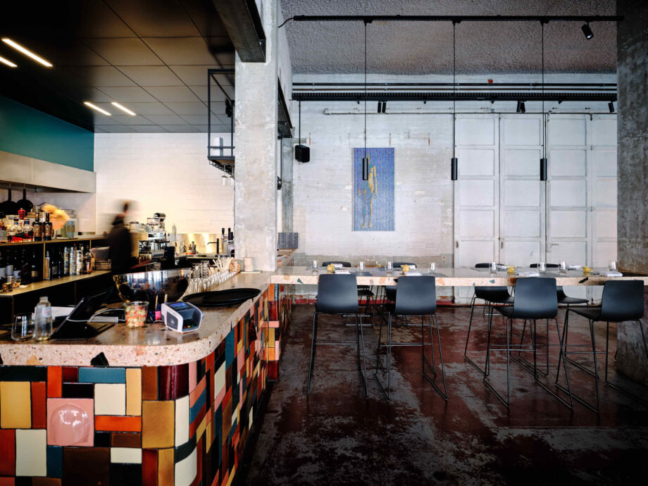
De Garage
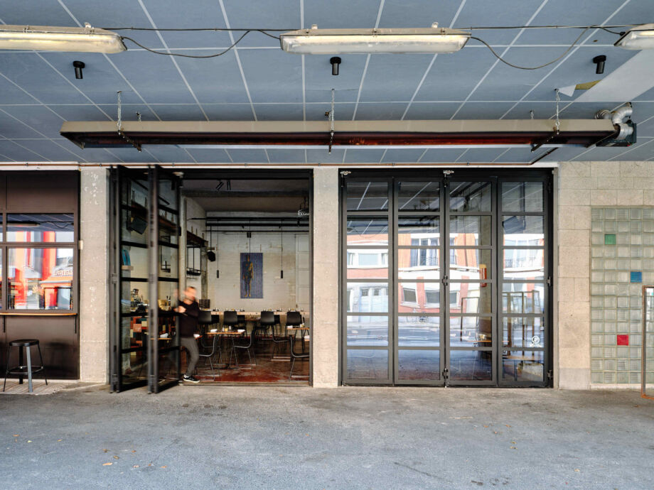
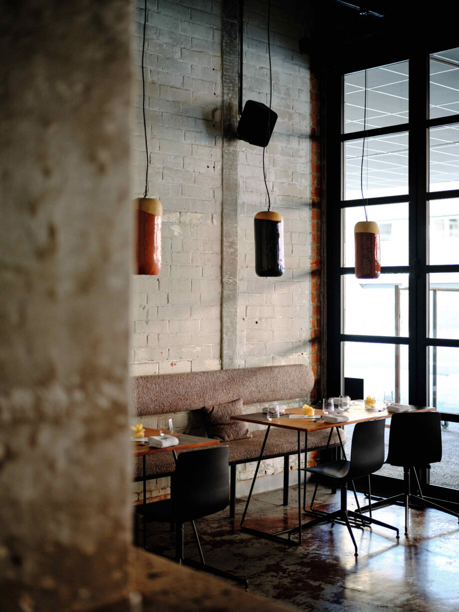
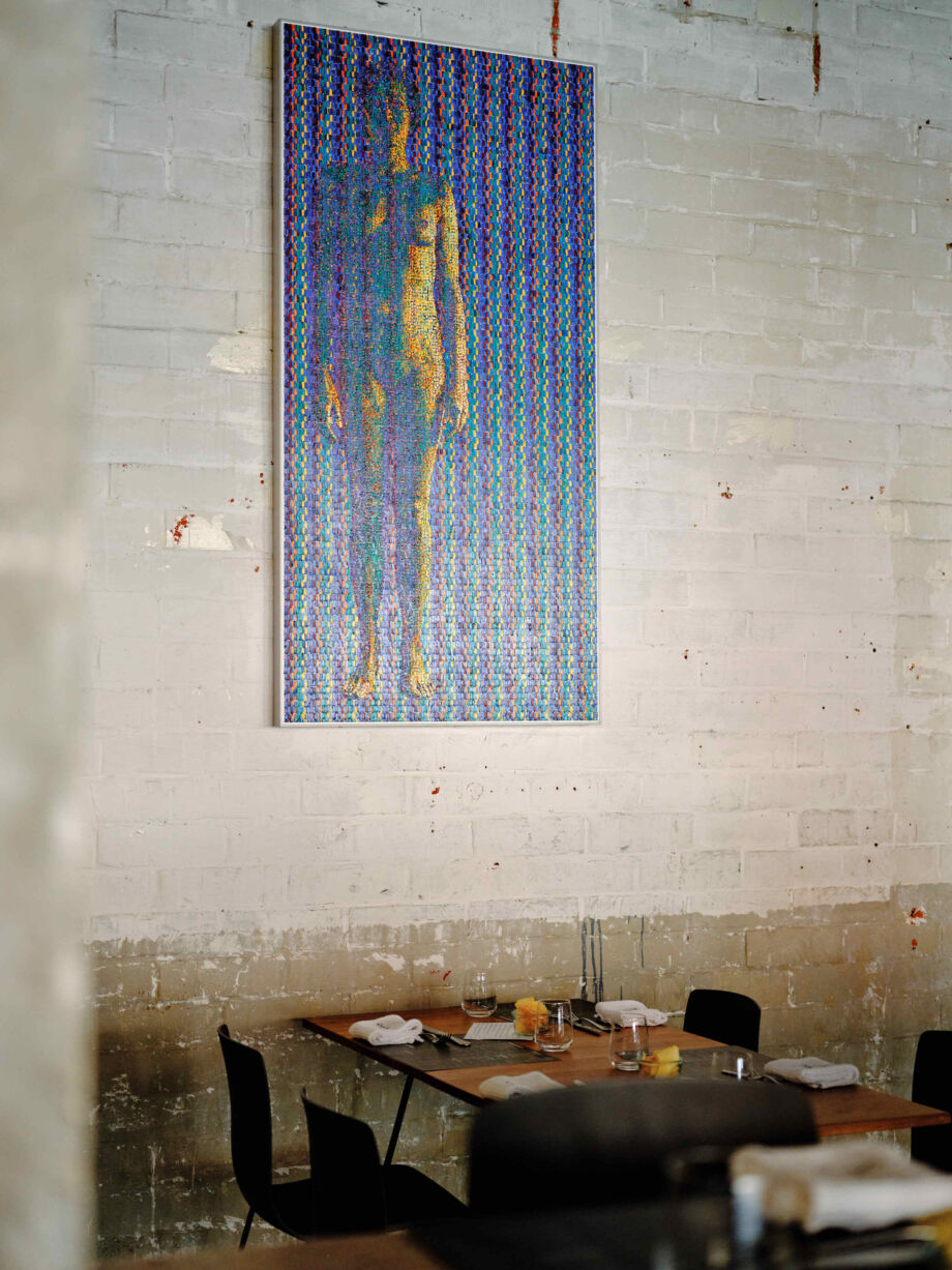
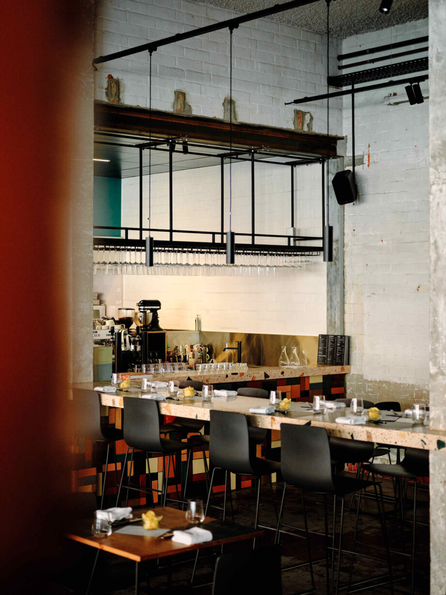
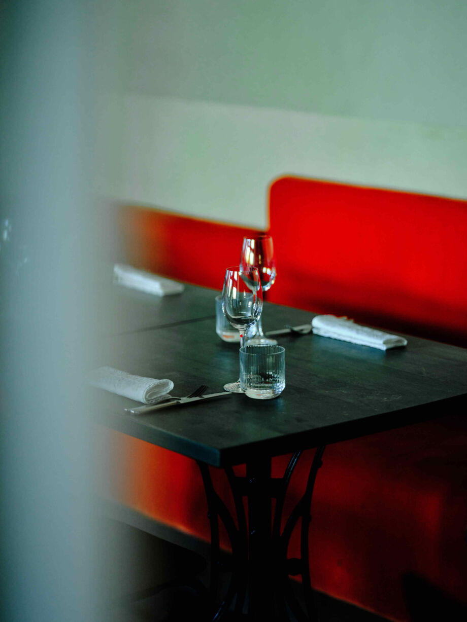
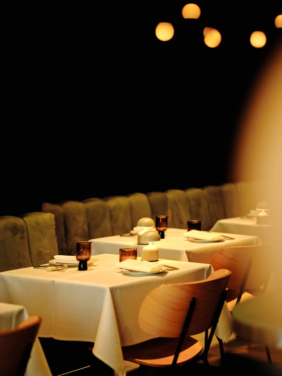
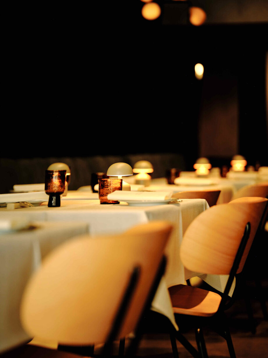
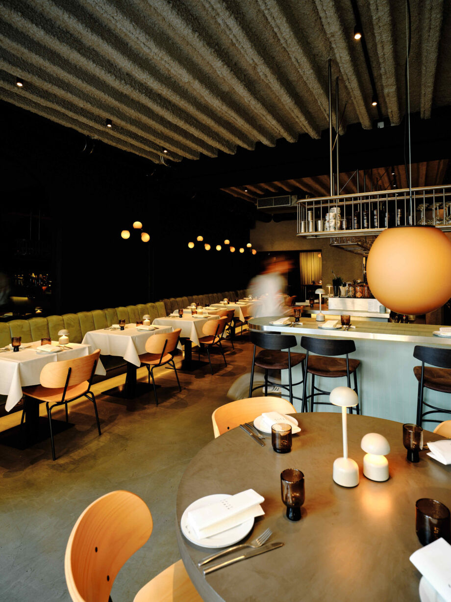
Transforming an old petrol station and garage into a sophisticated restaurant, retaining as many original elements as possible? That calls for a well-thought-out and, above all, exceptionally creative concept.
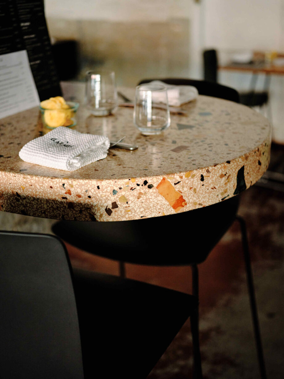
The industrial walls, floors and gates were ingeniously combined with elegant elements such as a handmade bar, ceramic lamps and custom-made guillotine windows.
All this guarantees a unique interior, which does justice to the equally unique restaurant concept.
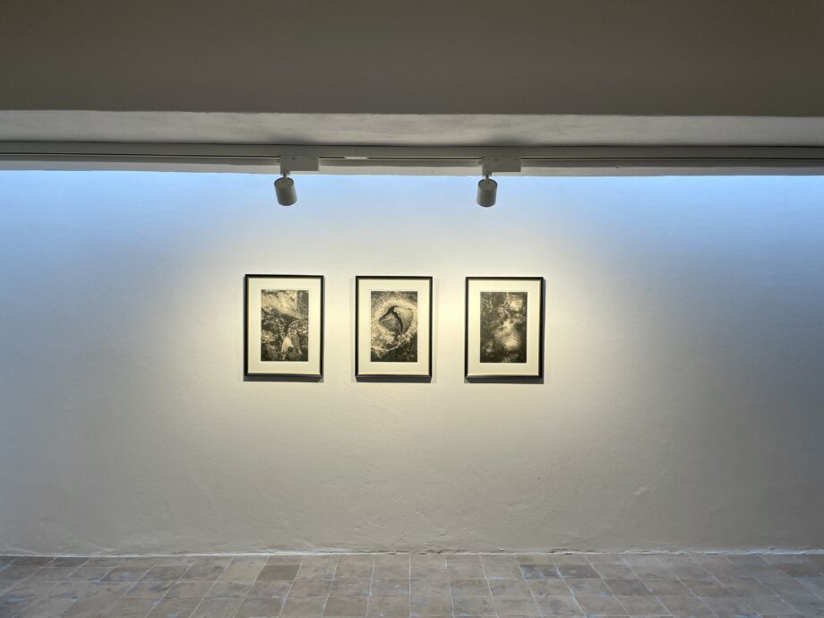
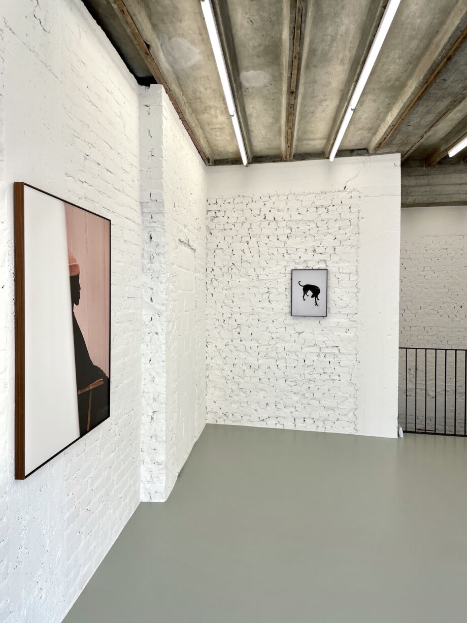
Fragma Gallery
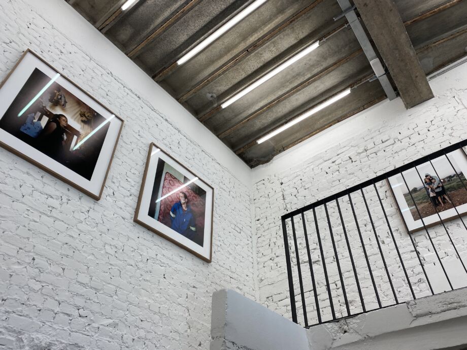
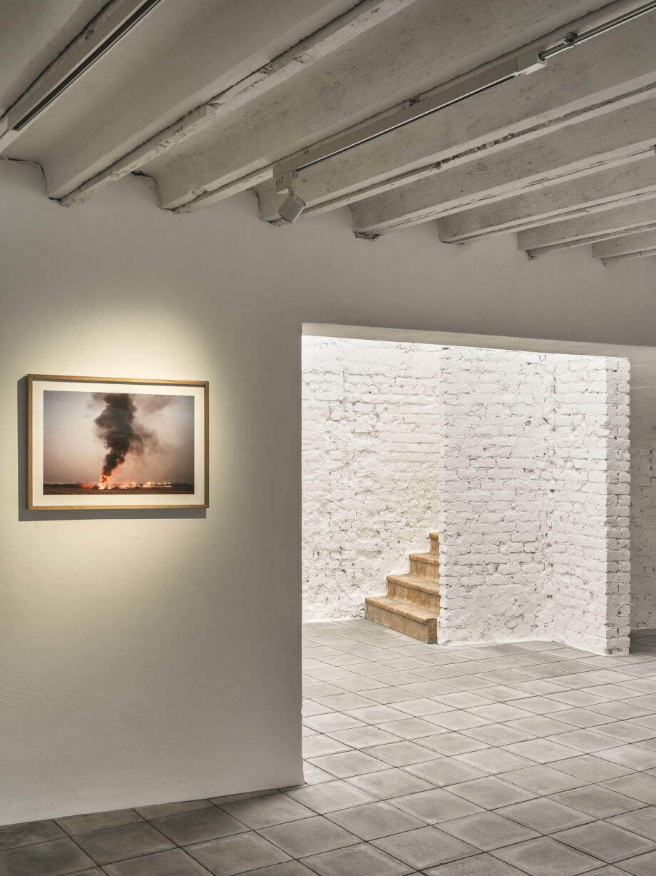
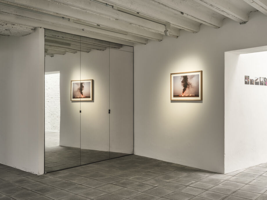
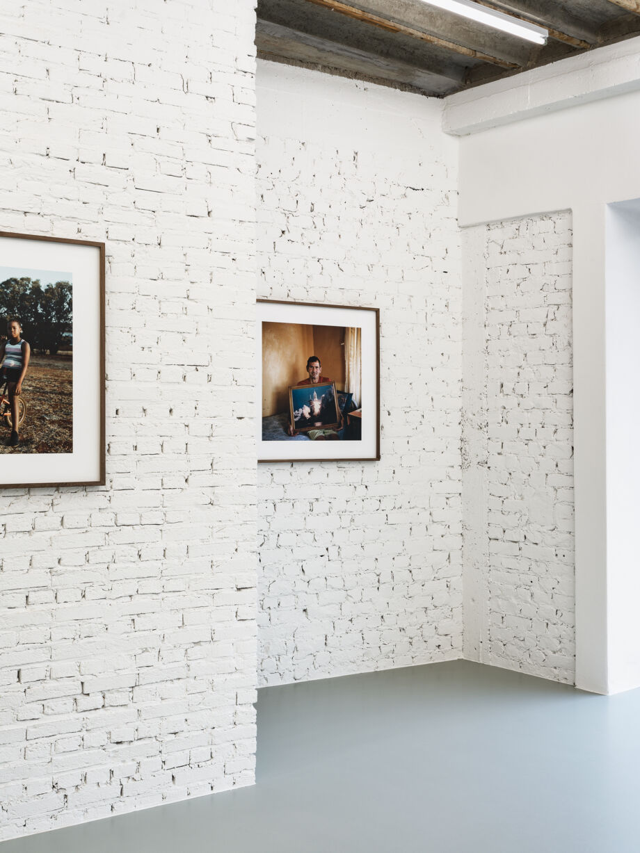
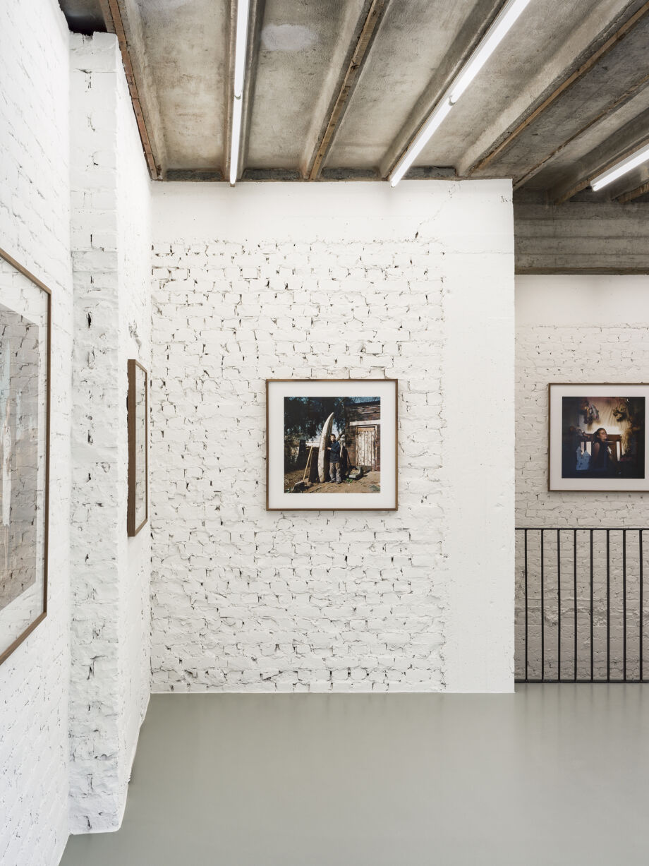
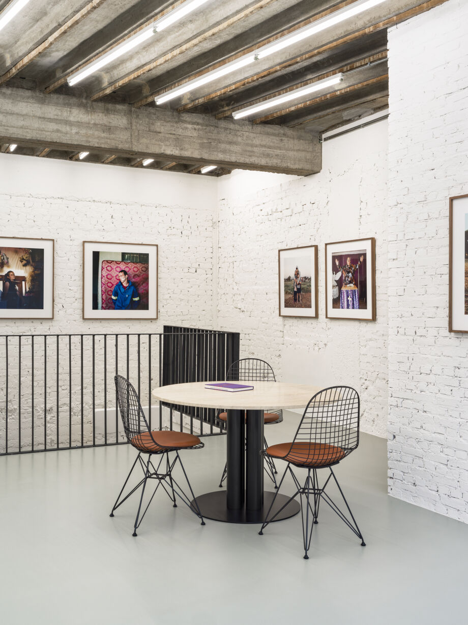
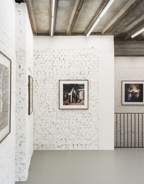
Fragma Gallery wanted to create a contemporary space in the middle of the cultural and historical centre, opposite the classic city theatre, to present their range of contemporary photography.
The space is divided into two levels, each of which had to have its own look and feel. Through a series of limited but very targeted interventions, Jessy Van Durme created a minimalist interior, in which the works of art can draw all the attention unhindered.
PARAZAAR & Kiki
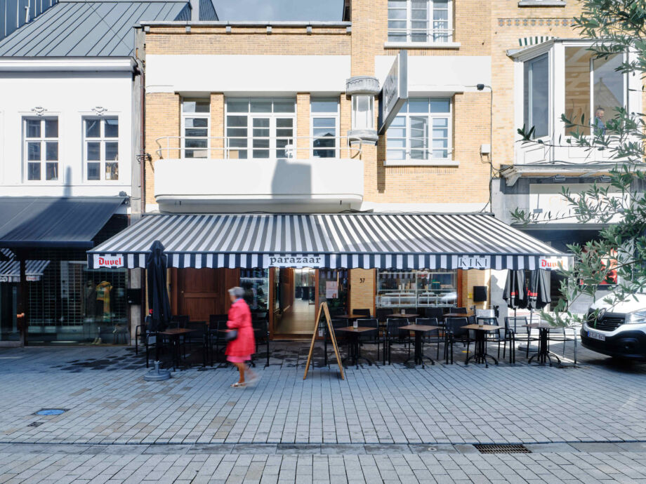
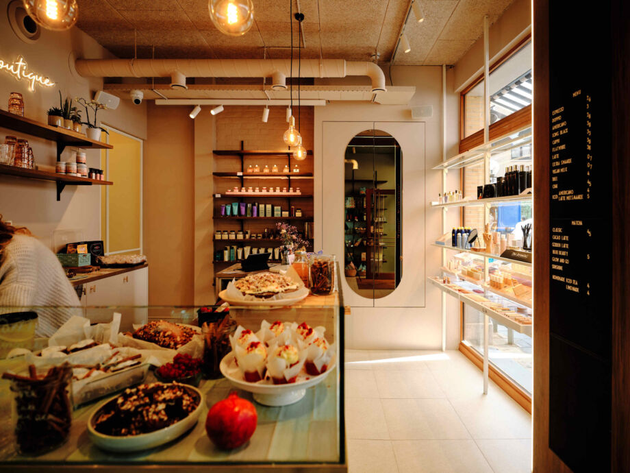
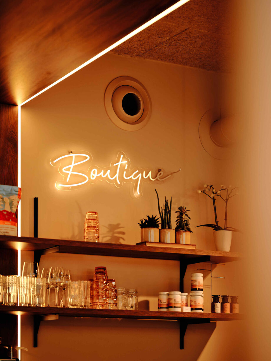
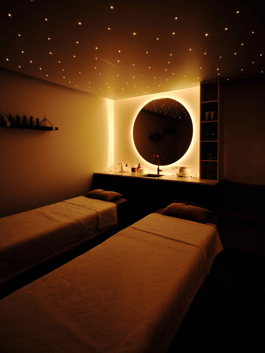
Food and beauty, a combination you won't immediately find in a weekday shop, but you will at PARAZAAR & KIKI. Under the motto 'sip & shine, beauty from the inside out', this unique concept store welcomes everyone who wants to integrate health and beauty into their lives.
An empty building in the Voorstraat, included in the real estate heritage inventory, had to become an equally unconventional home for this unique business. Architect Iris Dewitte succeeded brilliantly in connecting inside and outside, past and present. The bright, natural space provides the ideal backdrop for bringing together food and beauty.
Zimba
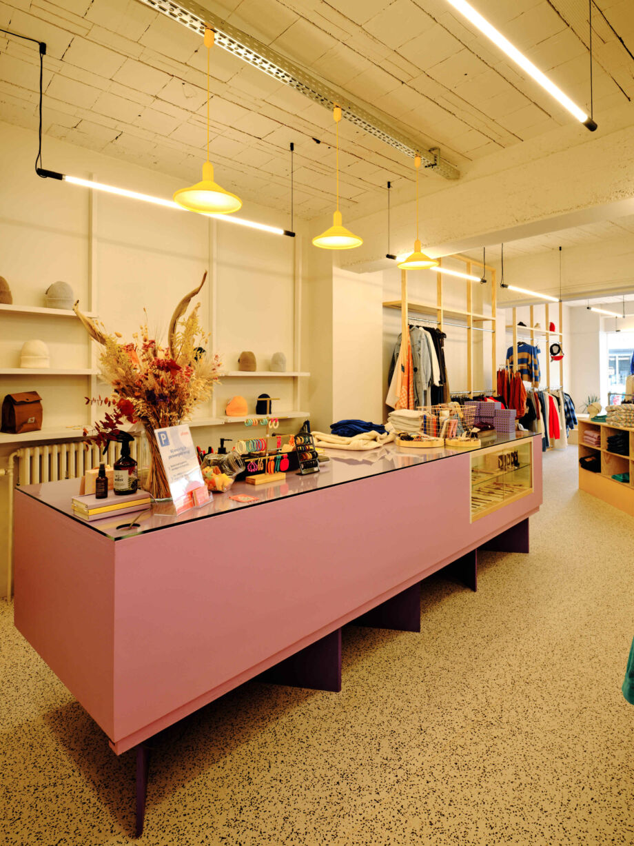
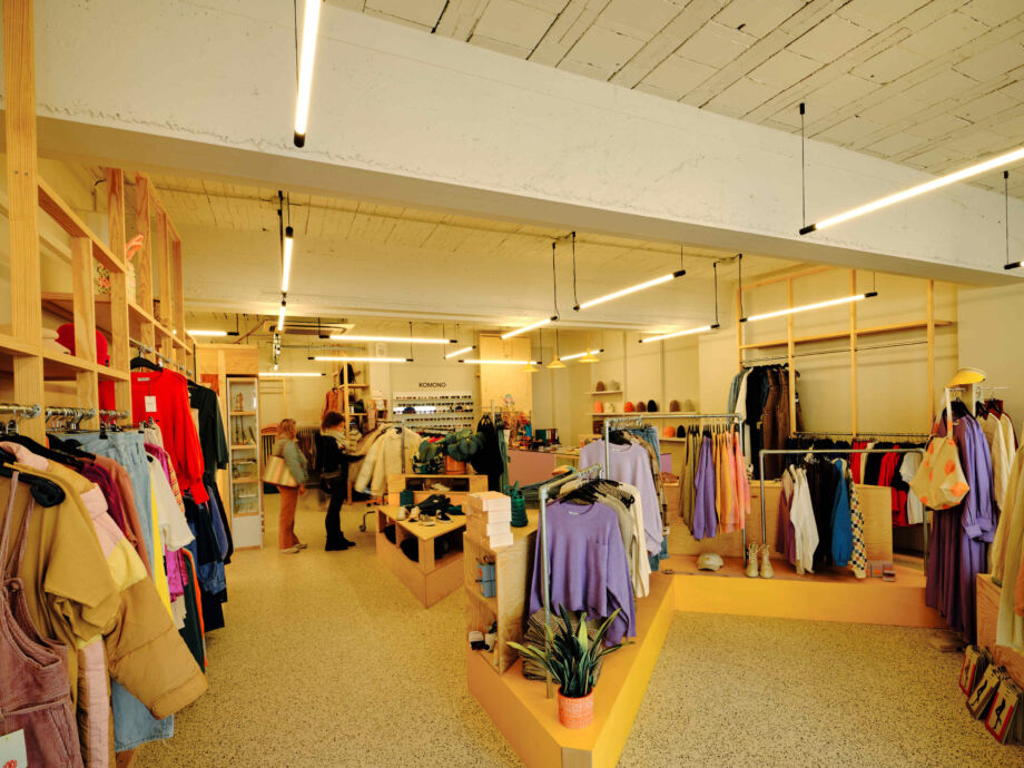
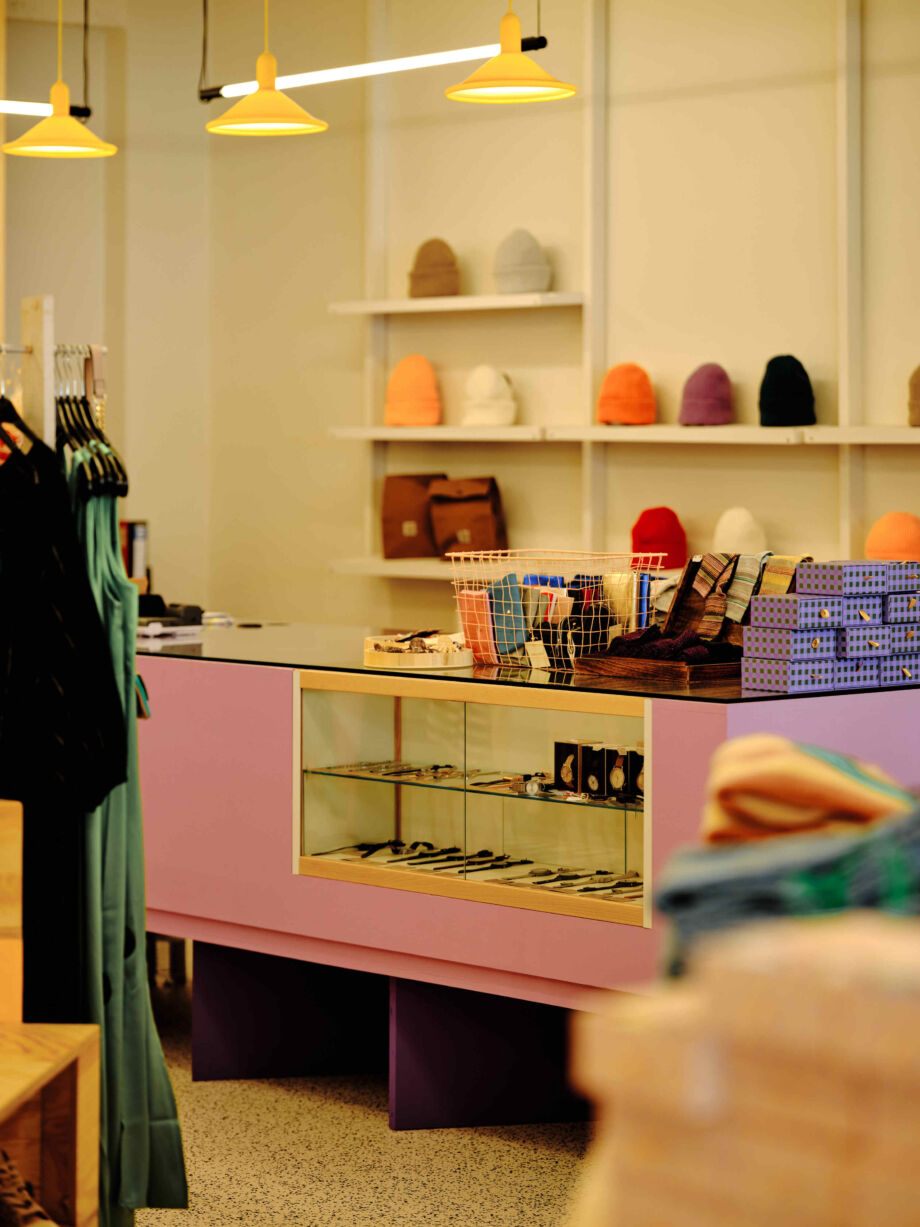
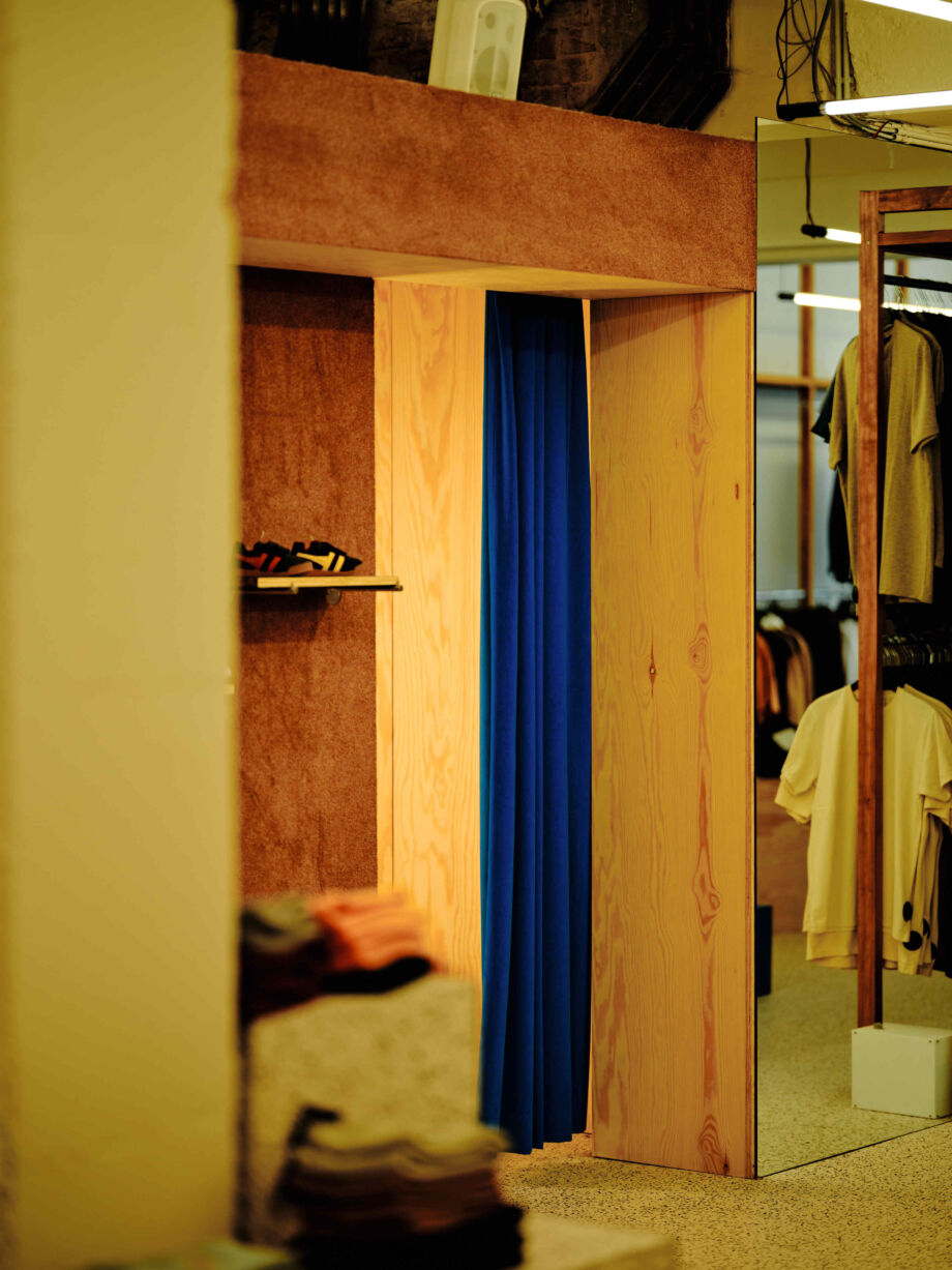
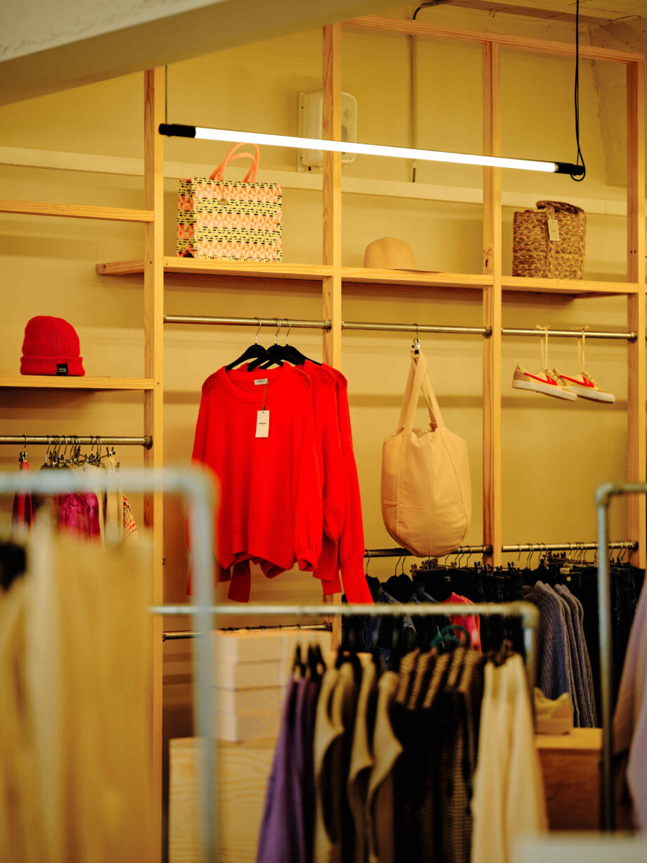
Clothing shop Zimba is located in a motley neighbourhood, full of shops and cafés. The previous interior was equally motley, which meant the clothes could not always 'stand out'. So Mökki Mökki was commissioned to completely restyle the shop, in line with the shop and the brands: quirky and contemporary.
The furniture is now functional and provides consistency. Customers have more space to browse around. And the combination of warm wooden materials with bright colours and graphic neon lighting set a clear but above all attractive tone that invites to look, feel and try on.
Crèmeux
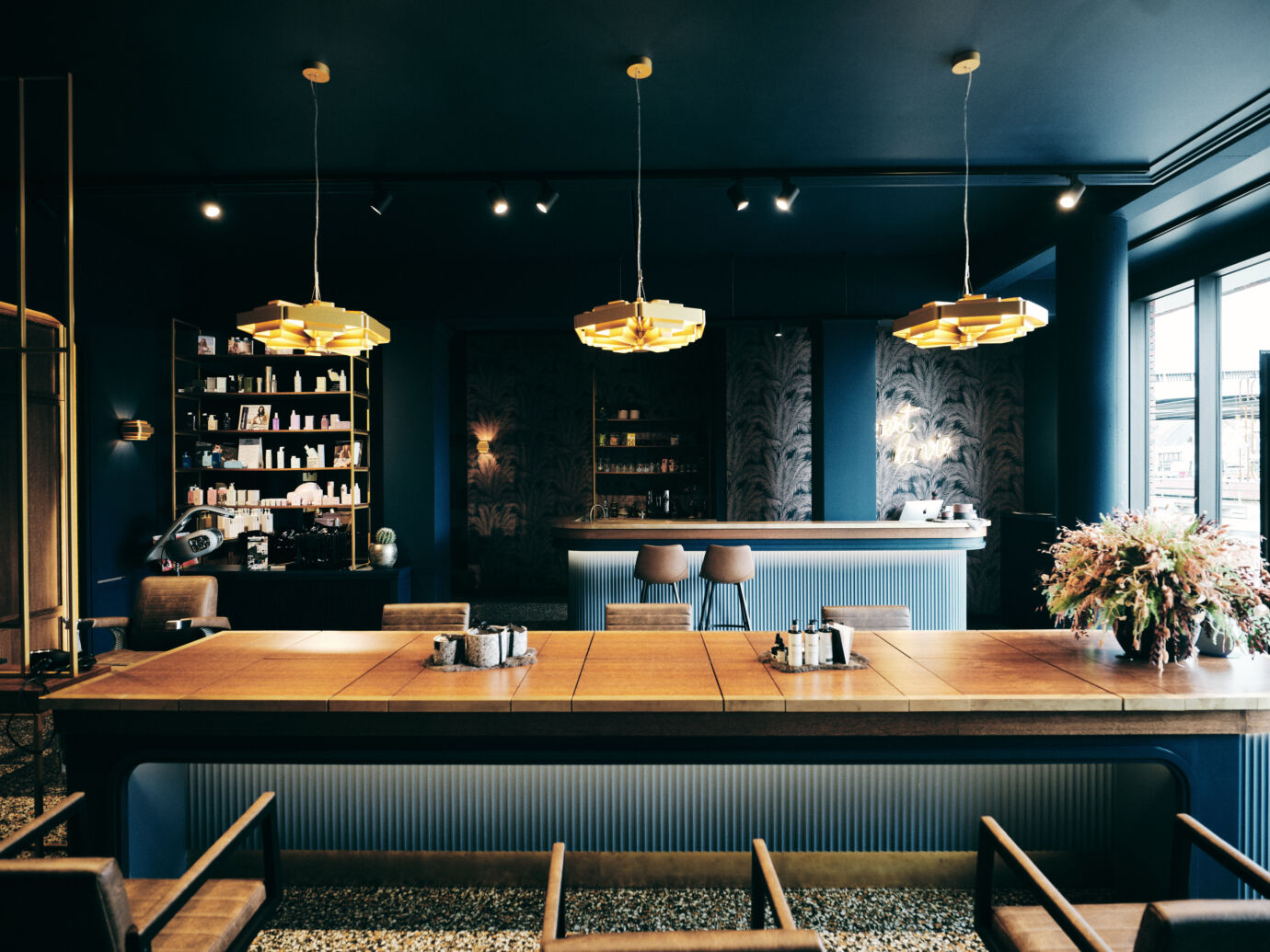
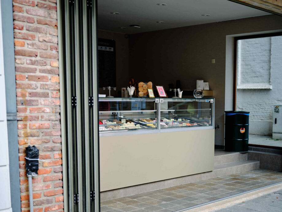
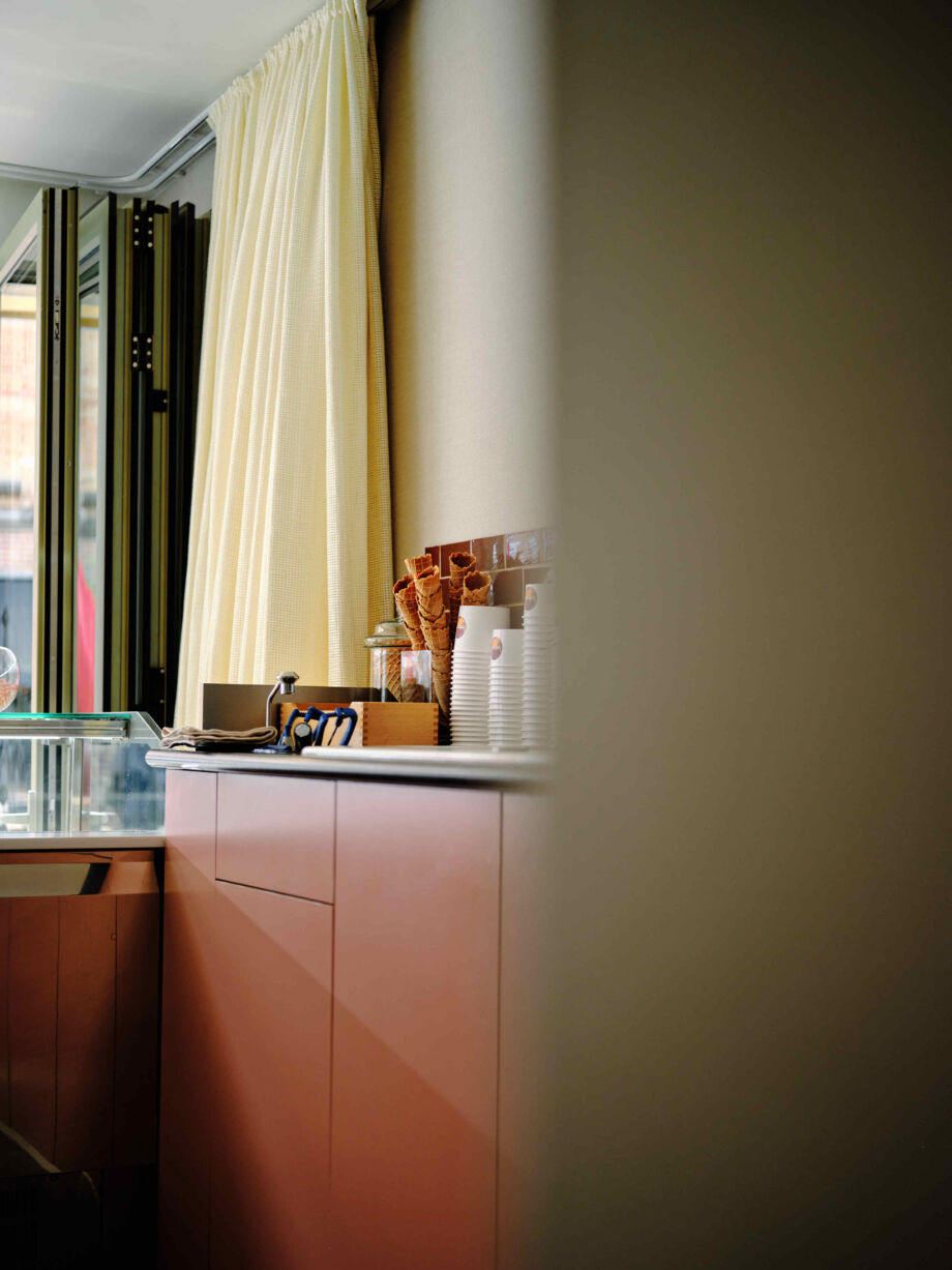
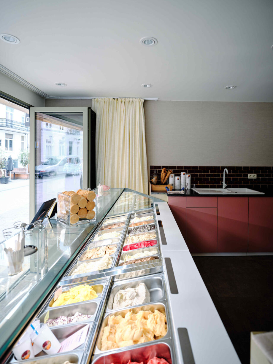
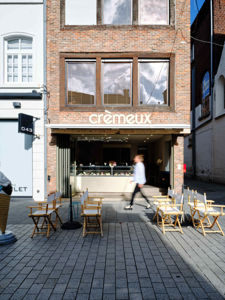
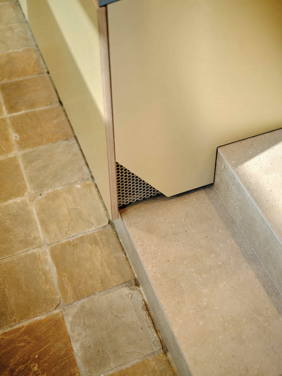
The delicious, artisanal ice cream at ice cream parlour Crèmeux is made from the best ingredients. That full, delicious quality should also be figuratively palpable in the interior. Architect Judith Ostyn therefore gave this house of taste a stylish, warm renovation that totally suits the product.
She created a beautiful indoor-outdoor relationship thanks to the folding window at the front, and combined both rich and delicate materials and colours that figuratively bring the ice cream parlour's name to life.
Het Vliegend Tapijt
Giving a well-known and appreciated restaurant a makeover without touching the warm atmosphere of the old days: that was the challenge Bjorn Verlinde took up. He took restaurant Het Vliegend Tapijt in hand in such a way that it feels like coming home not only to old but also to new customers.
The transformation is a successful graphic play, in which sleek geometric shapes and furniture, such as the black coffee tables, merge with soft, lighter elements such as the flowered glass sconces. It gives the restaurant a very distinct identity without being too ostentatious.
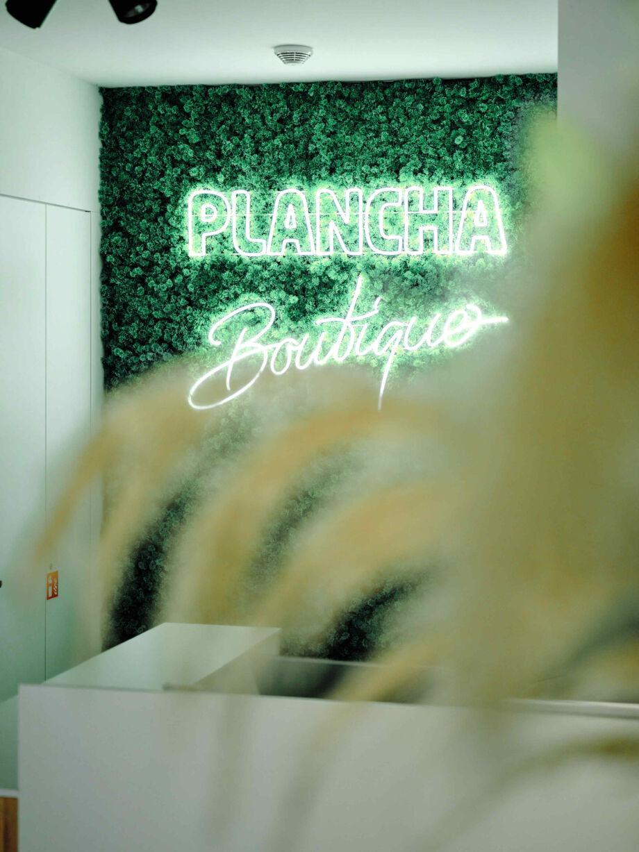
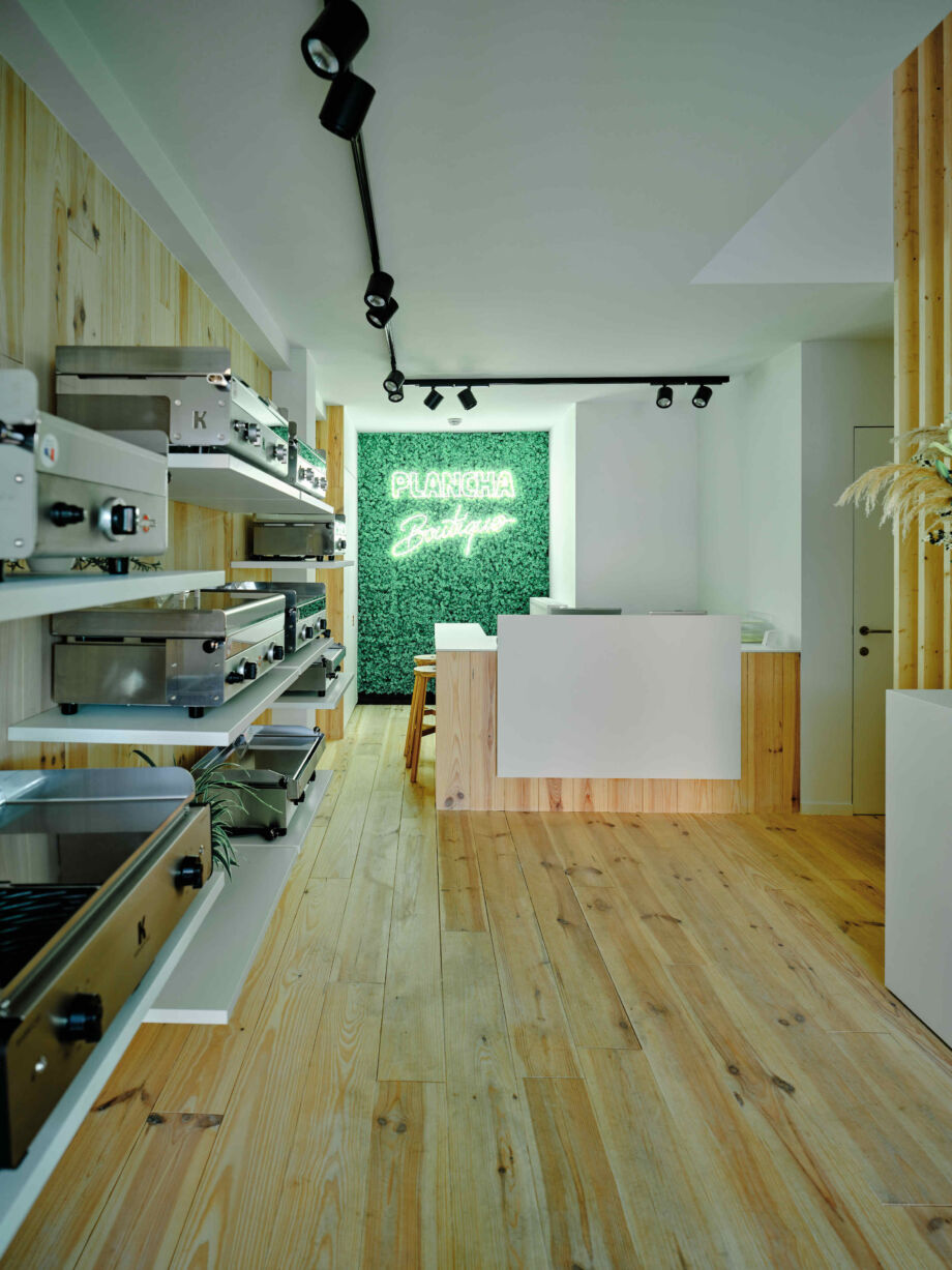
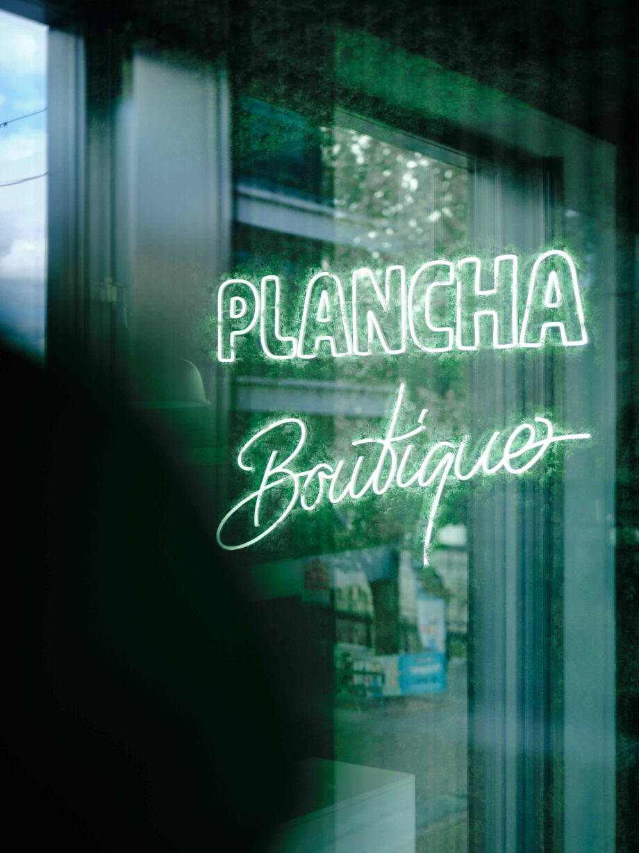
Plancha Boutique
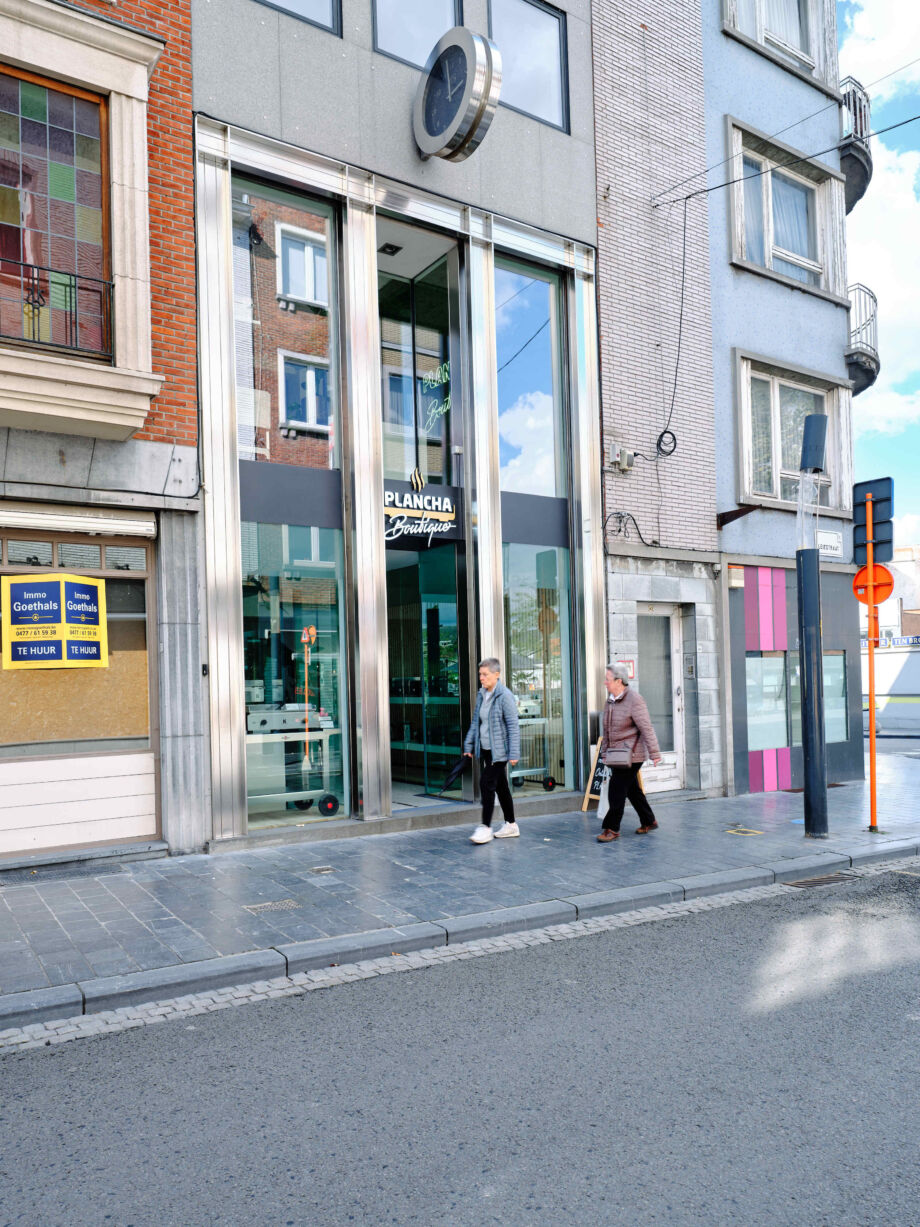
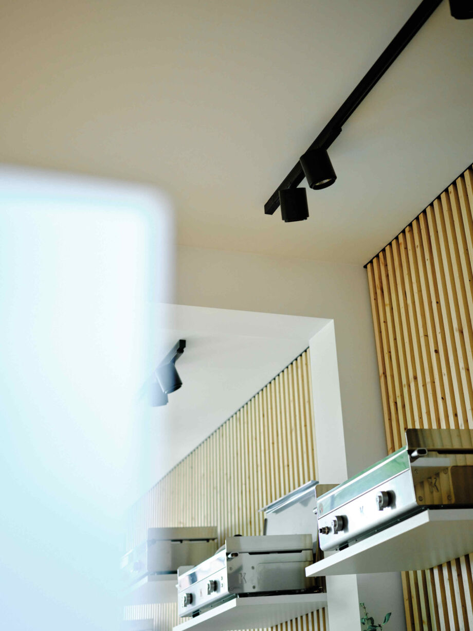
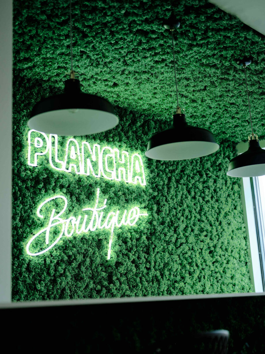
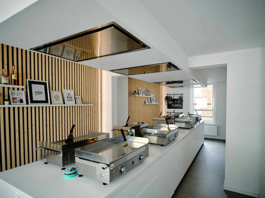
This plancha boutique was housed in the former Nys jewellery shop. Fugazzi was asked to completely transform the premises into a trendy specialist shop for high-quality panchas with workshop space. Because planchas are mainly used outdoors, the interior had to literally bring in that outdoor feeling.
Fugazzi went to work with lots of light wood, stainless steel and artificial grass (on walls and ceiling), and introduced a central island as a workshop. The trendy products now definitely come into their own in an equally hip and inviting interior.
Kruidbar
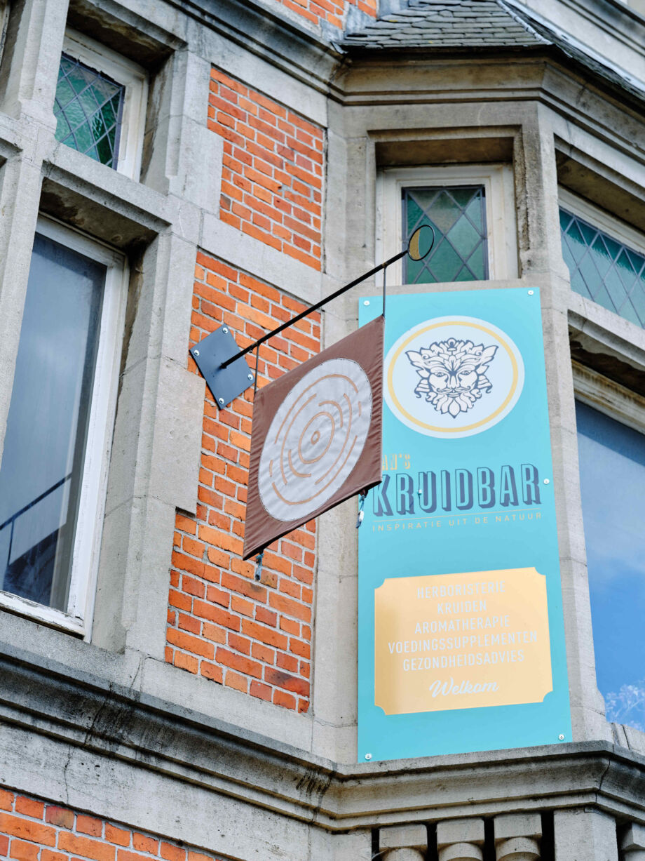
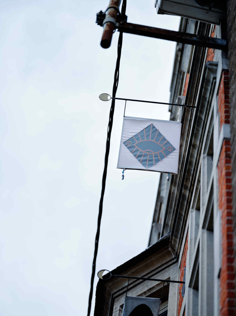
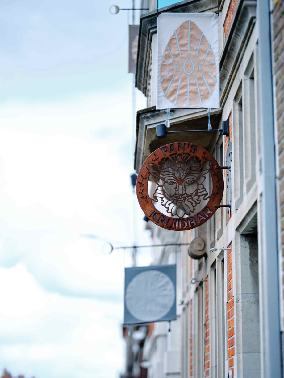
At this specialty shop, you can find medicinal herbs, herbal infusions, essential oils, food supplements, culinary herbs and so much more. Despite this special range, the shop did not stand out enough in the street scene. Lucie Colin was tasked with changing this.
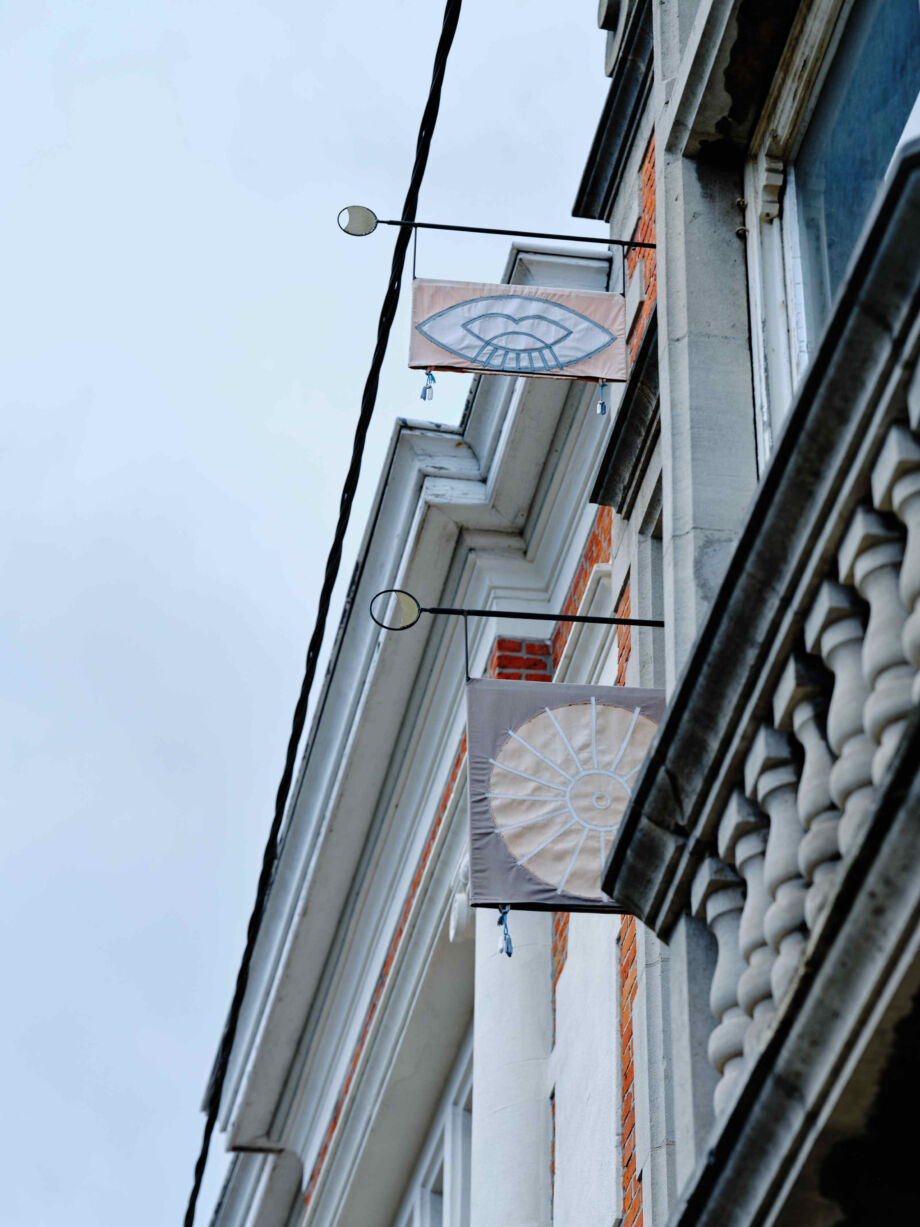
The protected façade and restrictions on the use of parking spaces did not make things any easier. However, Lucie Colin came up with a creative solution and designed several flags in the style and atmosphere of the shop. Thanks to the graphics, Pan's Kruidbar now literally stands out with flying colours in through traffic.
Soldeur - Wild van Stof
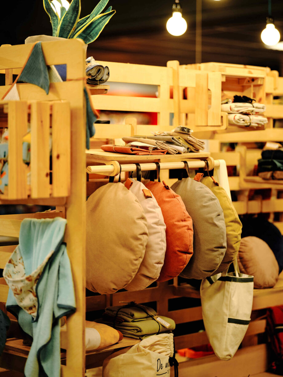
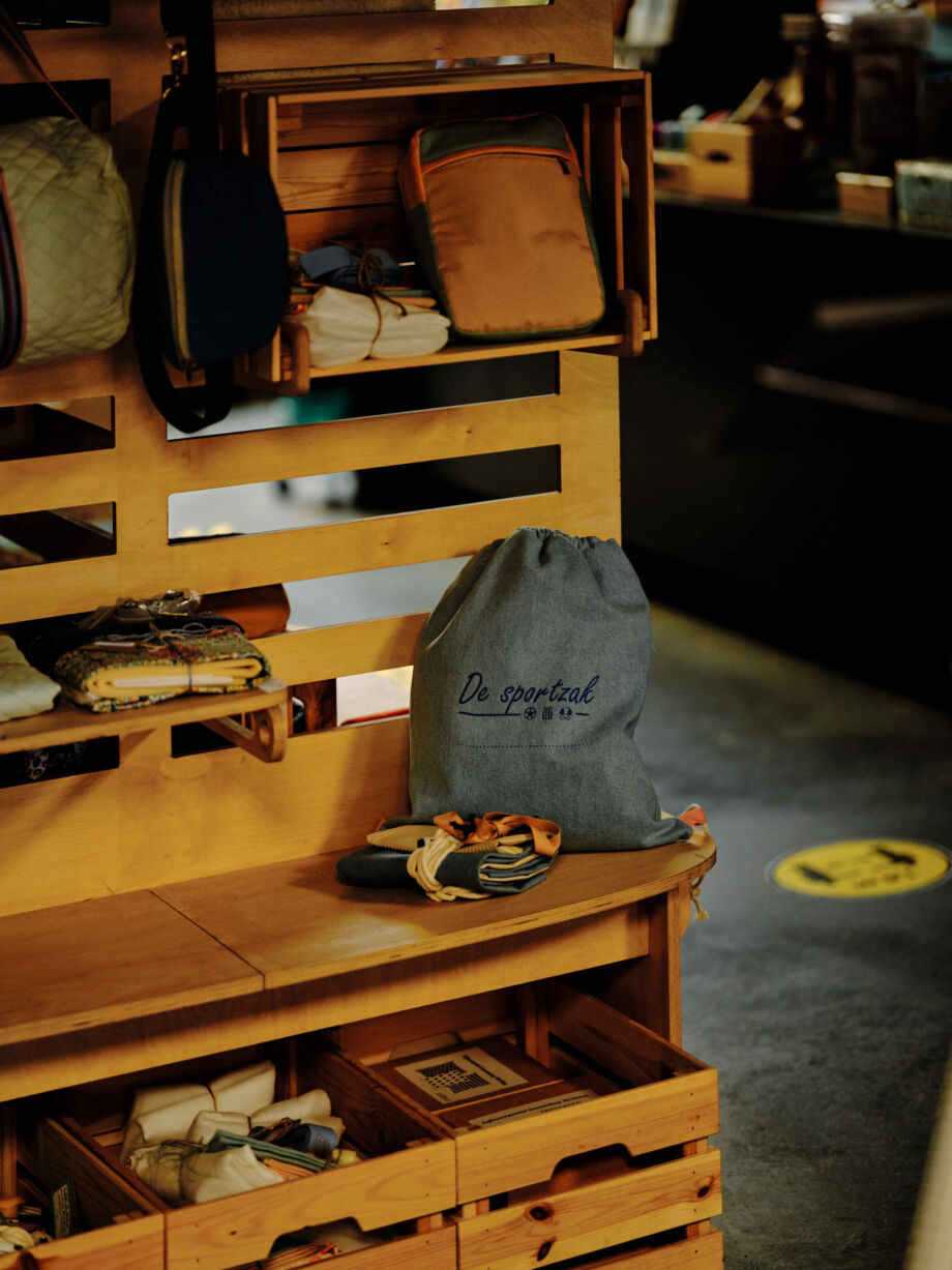
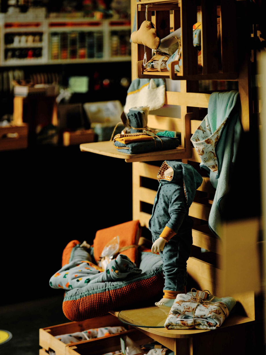
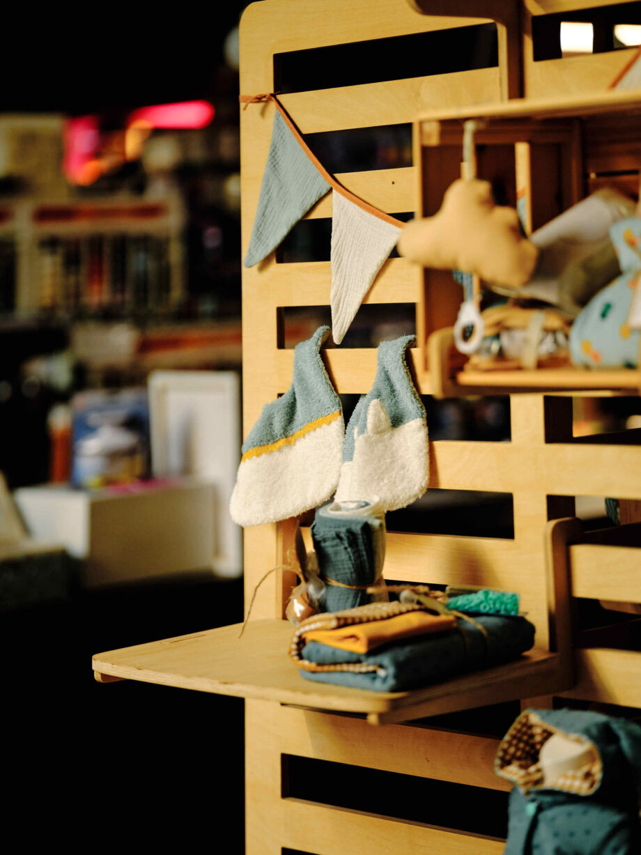
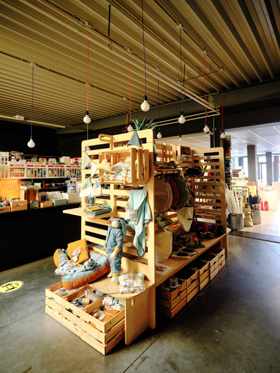
When you think of fabrics, you spontaneously think of clothing, but Soldeur also offers original all-in fabric packages for bags, aprons, baskets, baby furnishings, cushions, etc.
Tomish Design was commissioned to create an original shop furniture in which those packages can be presented in a creative way.The result is a modular furniture that is robust and at the same time looks light. It is also extremely flexible and provides 'oxygen' between the many fabric packages. No more fixed arrangement, but a changing presentation that means there is always another beautiful fabric catching the customer's eye.
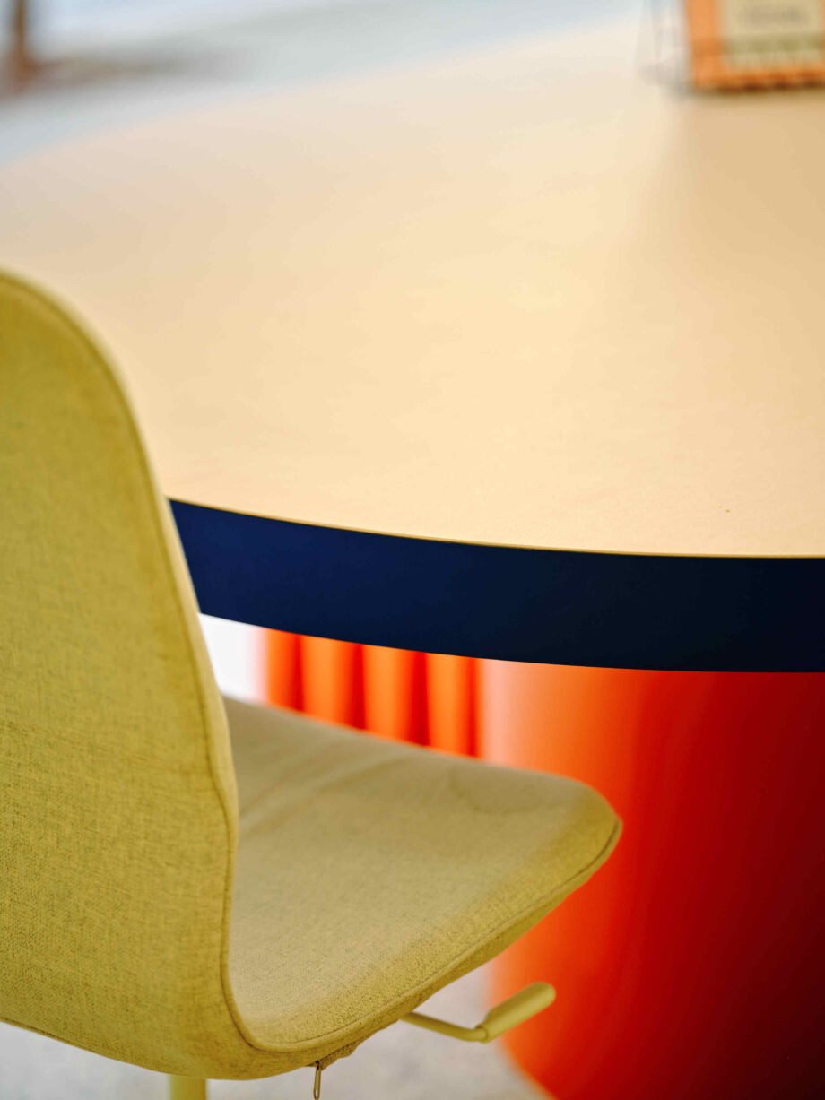
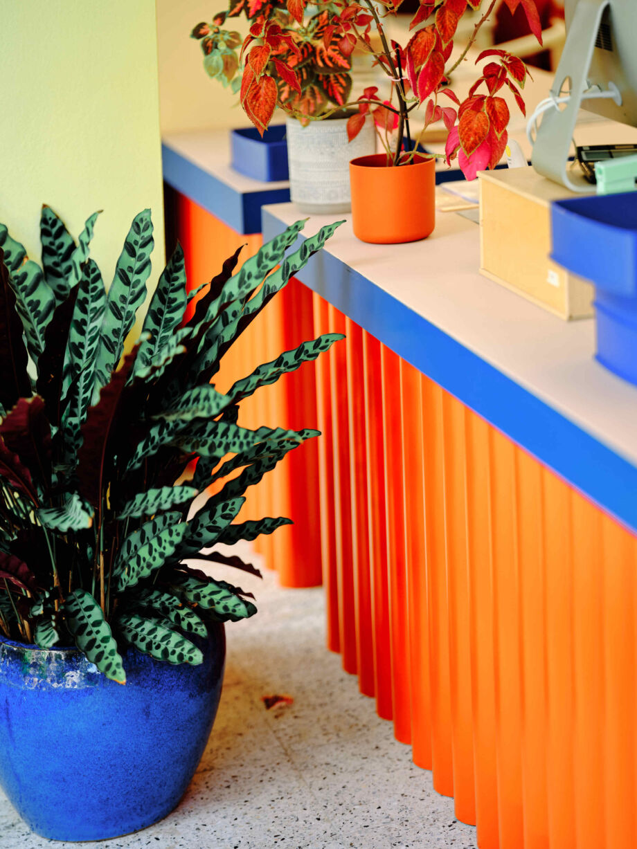
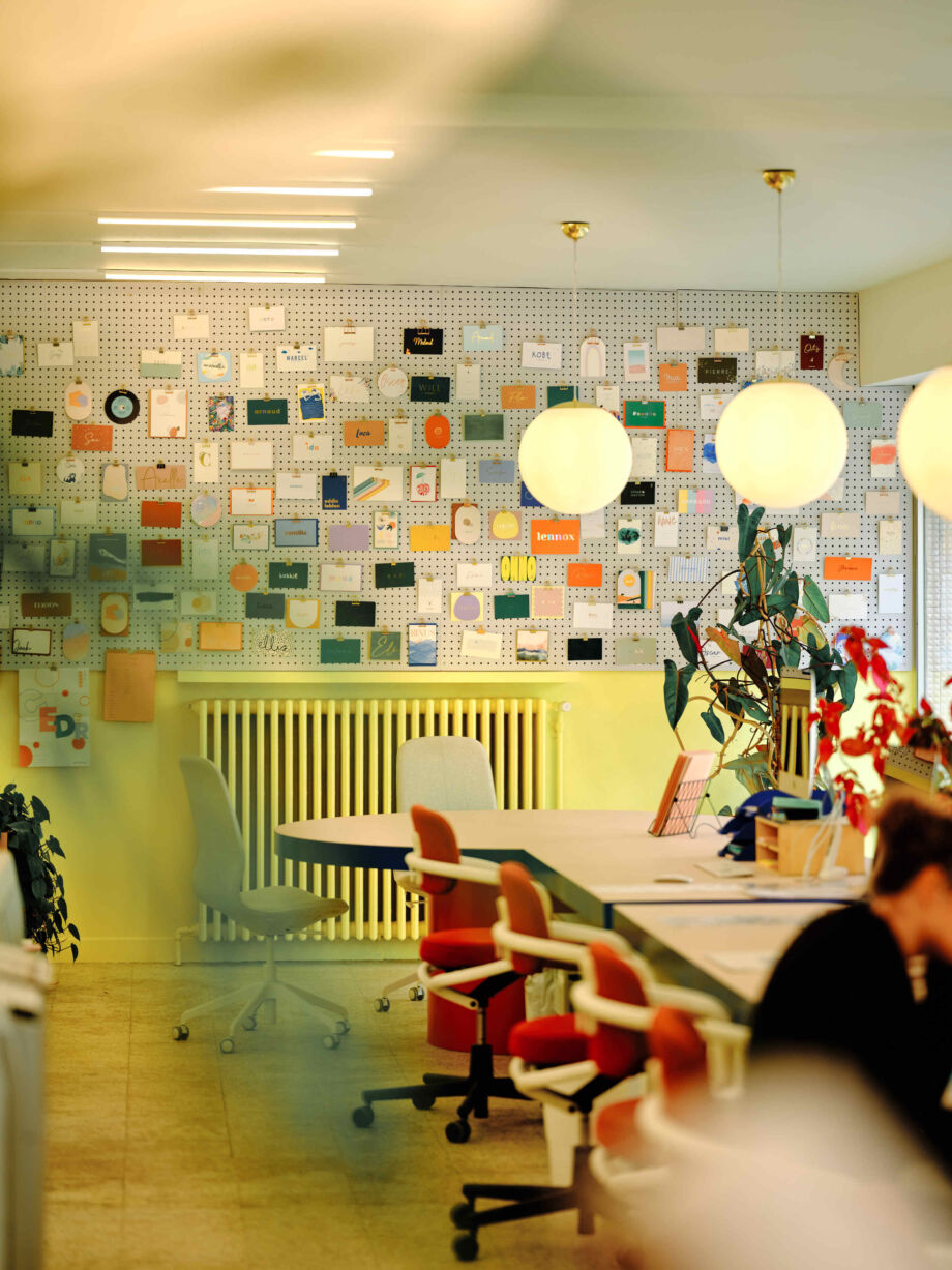
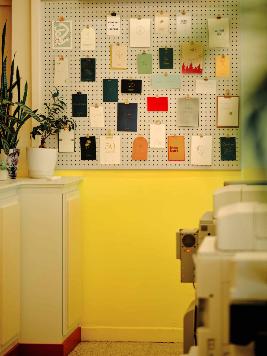
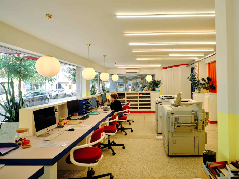
Drukkerij COCO
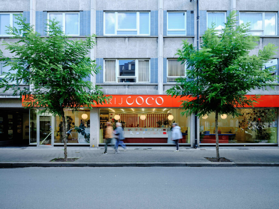
Turn a boring business like a print shop into something really distinctive and lively where customers spontaneously feel happy? Printing Coco was convinced that Axelle Vertommen and Dries Otten could make it happen.
And they did not disappoint. The grey neighbourhood around print shop Coco is now broken up by a striking façade. Inside, playful design choices, unusual materials, bright colours and geometric furniture create a truly cheerful effect, while the business does not have to sacrifice any functionality.
Spicy Lemon
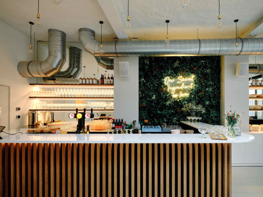
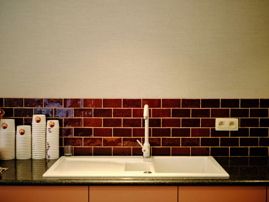
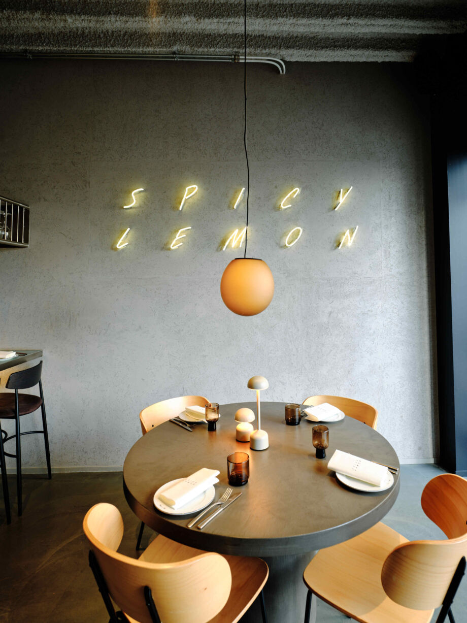
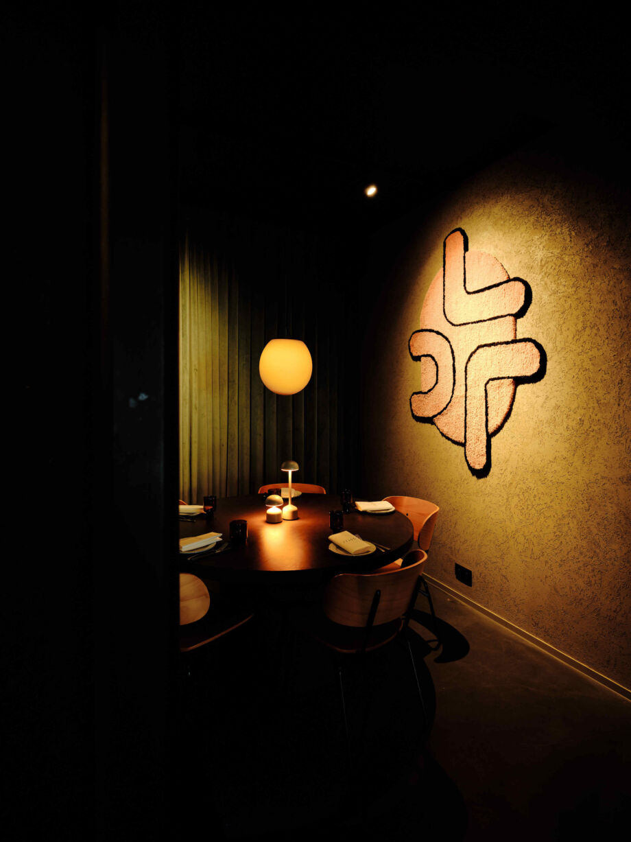
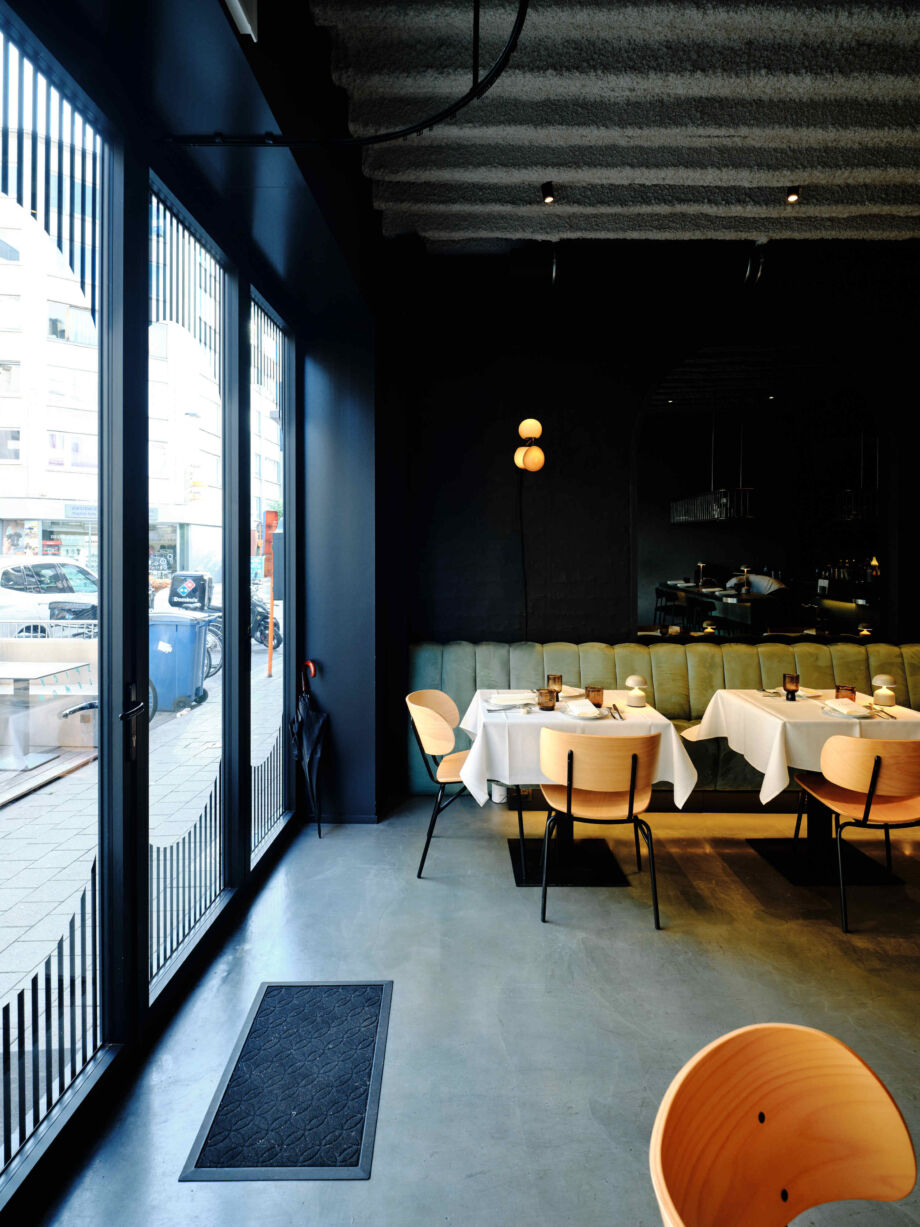
A Middle Eastern dining experience inspired by Persian cuisine: this is what restaurant Spicy Lemon guarantees. With the renovation of their premises, Spicy Lemon wanted to complete the overall experience and bring a bit of New York to Kortrijk. Thanks to the collaboration with Stay Studio, they succeeded admirably.
The original structure of the ceiling was exposed again. Materials such as brick and concrete provide an industrial, urban touch, while wood brings a touch of warmth. The combination of high and low chairs with the pastel colour palette of counters and walls completes the picture.
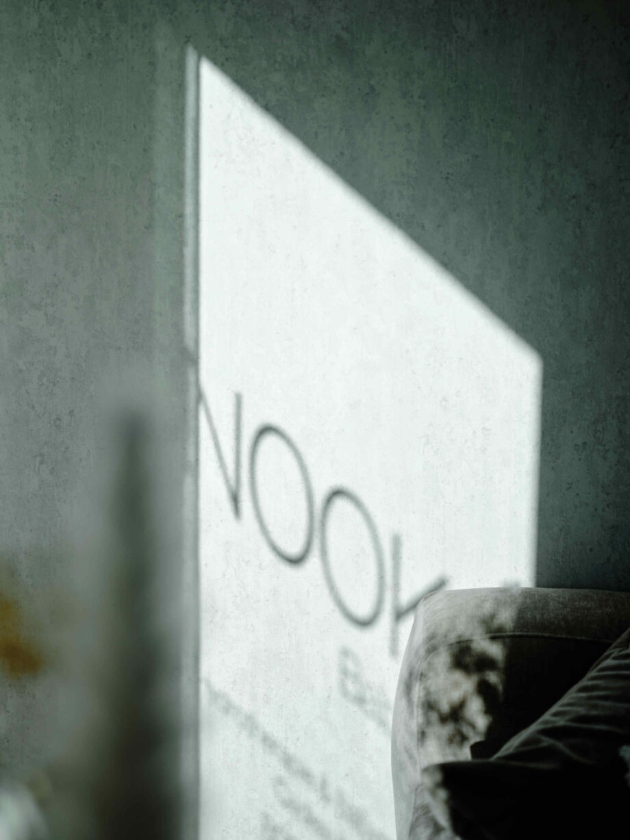
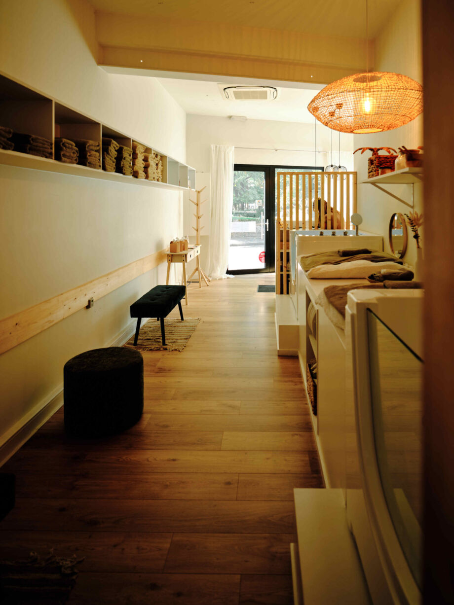
NOOK Babyspa
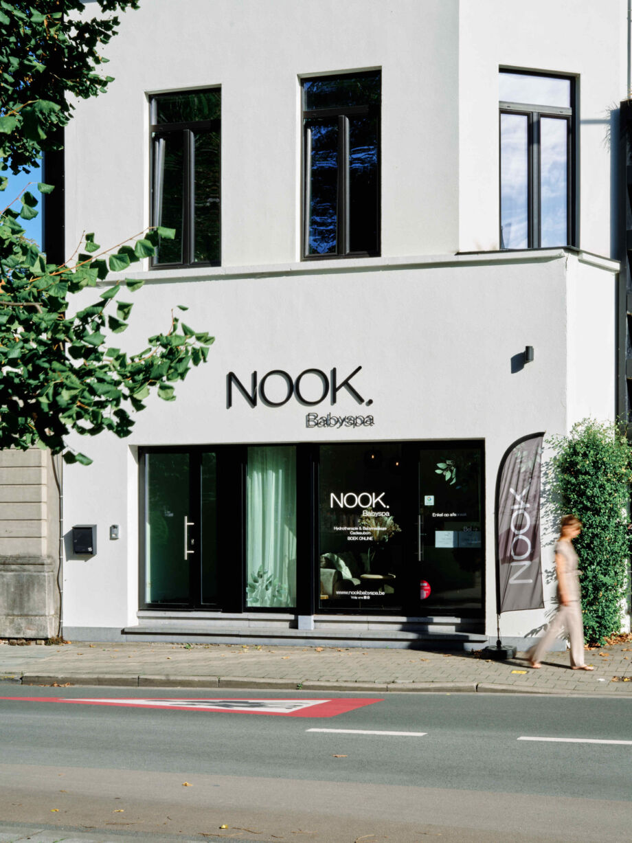
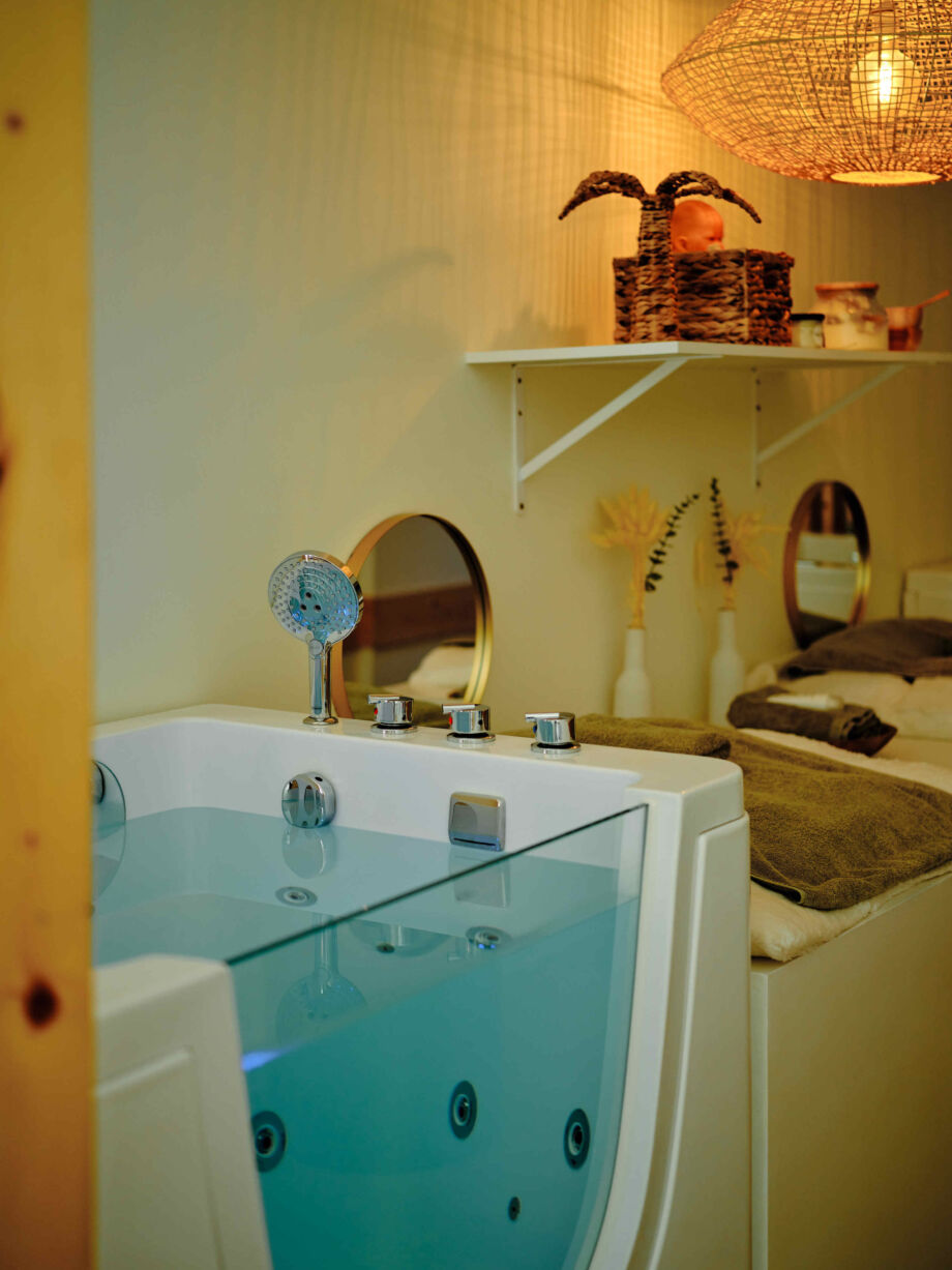
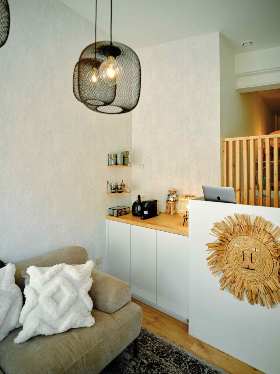
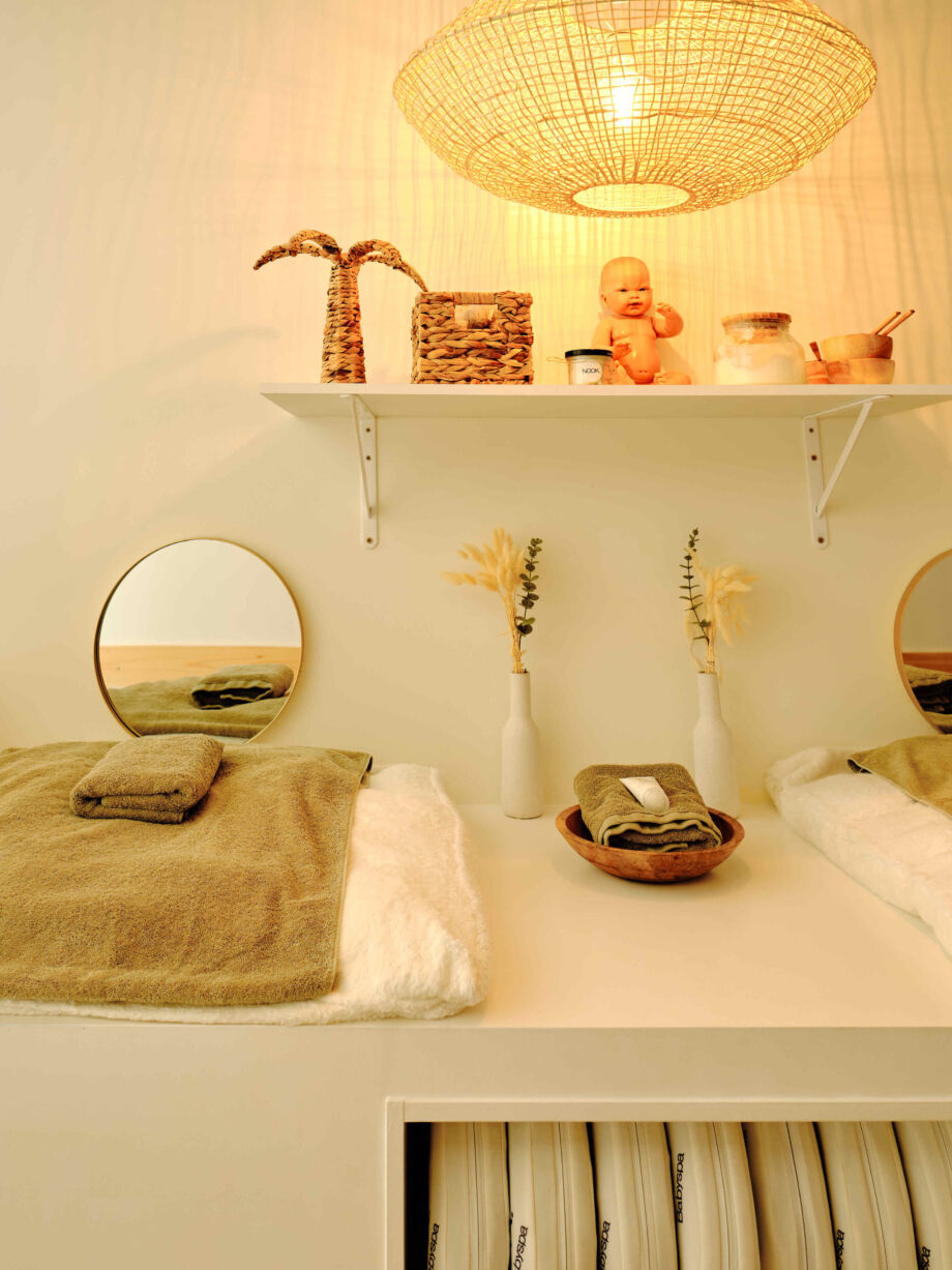
Babyspa NOOK prides itself on enabling both babies and parents to unwind in a commercial-medical yet cosy atmosphere. An interior that is both hip and relaxed had to help create this atmosphere and distinguish NOOK from other baby specialty shops/wellness centres. Quite a challenge for Lionne Design, but clearly not an impossible task.
She used all available space and created a visual connection between the baby area and the parent area. Together, the natural materials, light colours and contrasts, and carefully arranged furniture create an airy sense of space and calm, and make NOOK feel like home.
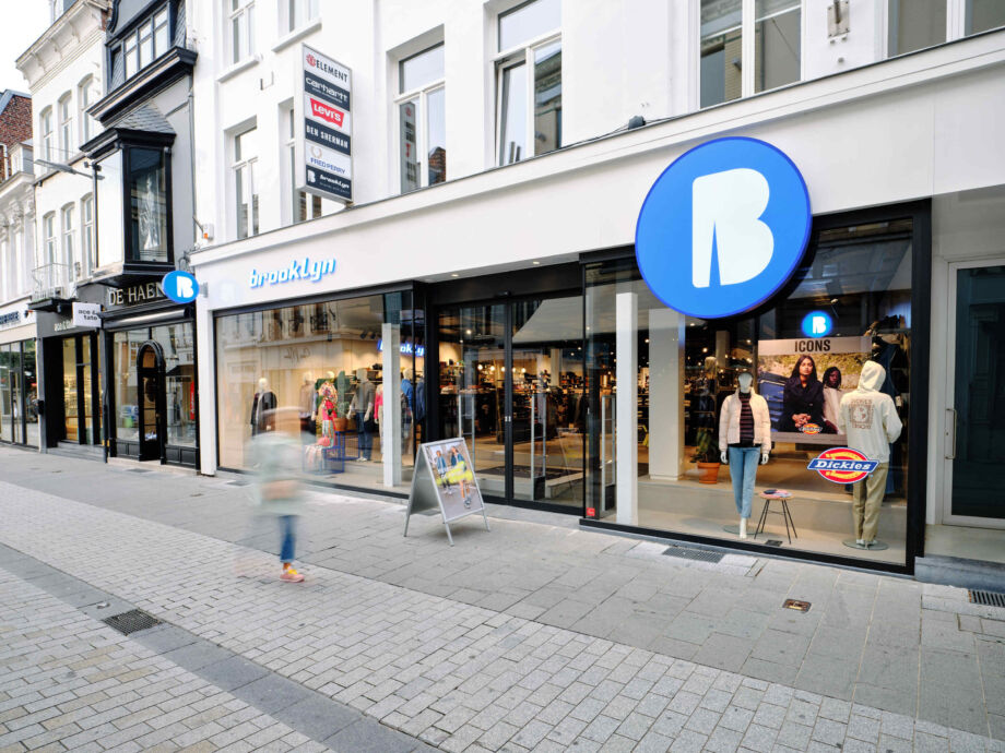
Brooklyn - Brands and pants
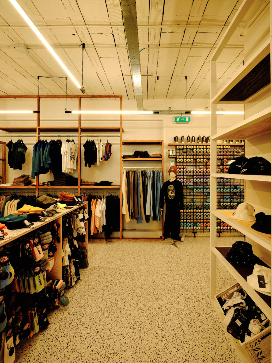
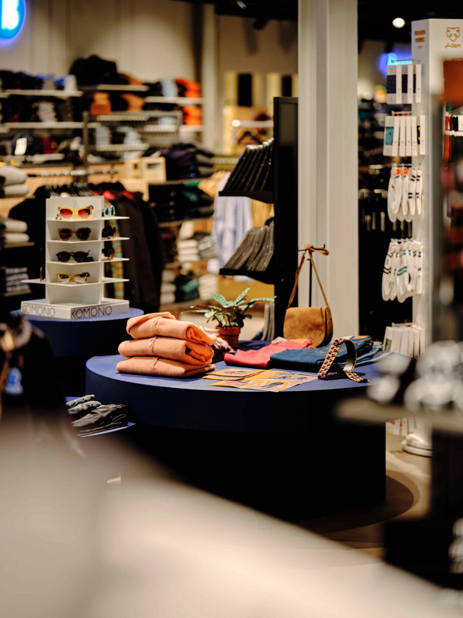
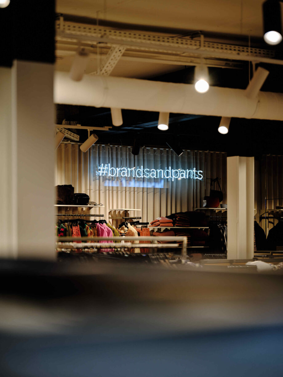
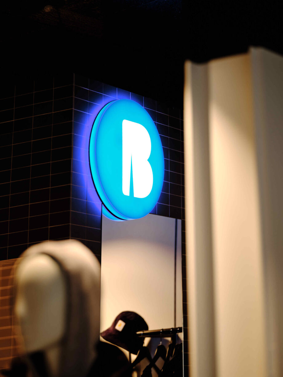
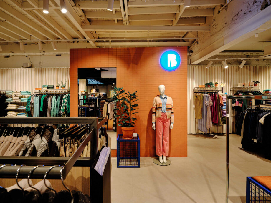
Brooklyn - brands and pants is a multibrand store for men and women, with a large selection of jeans. 5AM was asked to come up with an inspiring concept for the Kortrijk shop, but one that could also be applied in all Brooklyn shops and that appeals to the entire (broad) target group.
The thought exercise resulted in an easily accessible, light and open space, in which the large range of jeans, Brooklyn's trump card, literally and figuratively gets all the focus. The thematic display windows that respond to what is going on, the entrance of fresh outside air, the state-of-the-art sound installations, the original presentation furniture: everything contributes to a unique, urban shop where customers can easily find their way around.
Me Made
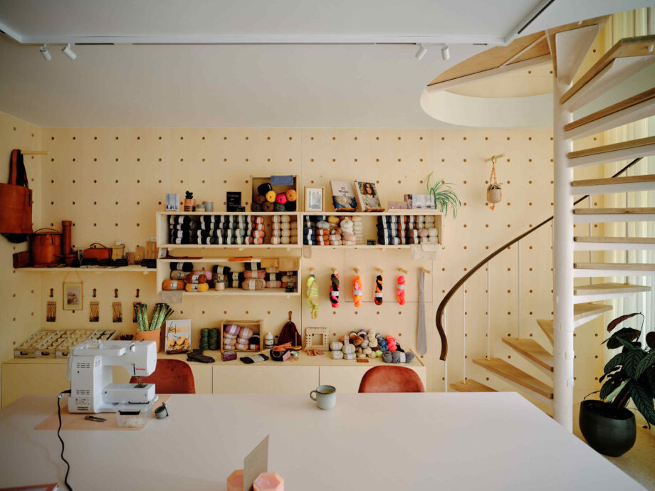
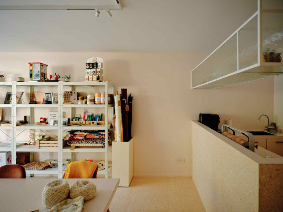
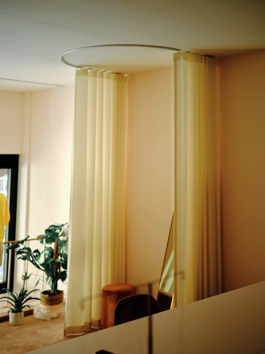
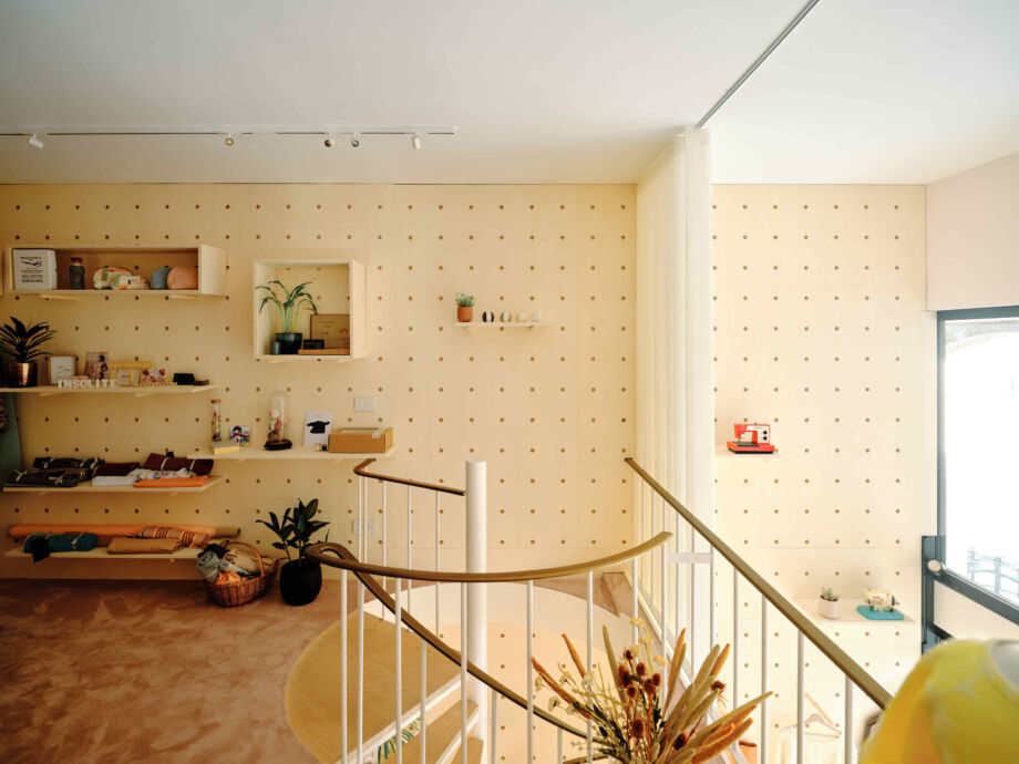
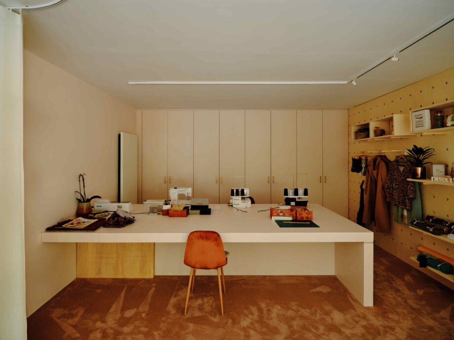
Converting a shell building into a craft shop with workshop space and a sewing studio? Stay Studio and MARKLAND architects joined forces and ideas with Me-Made, turning the empty, dark space into a light-rich, welcoming place, where slow fashion and slow shopping come together.
To do so, they made very conscious and more than successful choices, such as working with the same materials that continue both horizontally and vertically, integrating architectural lighting and using modular displays. The combination creates an airy, calm atmosphere that invites slow activity.
The Commerce Design Kortrijk jury
Our expert jury has made a selection from the many entries. On 25 October, they will present the Jury Grand Prizes to the winners. Jury members:
Marjorie Heuskin, Assistante de Projets, Ideta - Partner Design IN
Thomas Chuzeville, Responsible Design & Innovation, Lille Design - Partner Design IN
Leonie Van Damme, Design Director Interior, We Want More
Jacinthe De Guire,Commissaire au design, Bureau du Design, Montréal
Marie-Amélie Cnockaert, Urban Designer
Mathieu Desmet, Stadsarchitect, Stad Kortrijk
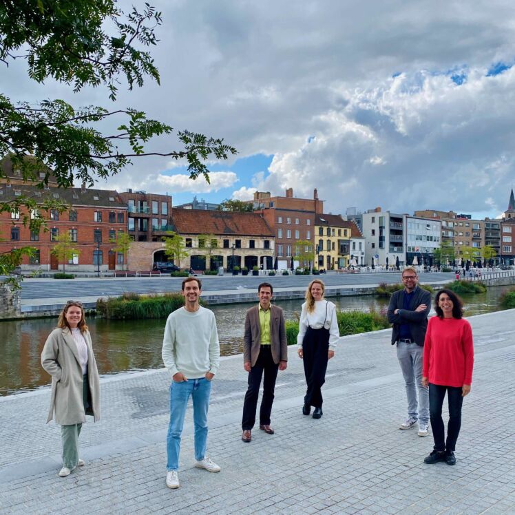


Sébastien Hylebos
Sébastien assists businesses in innovation and design. He is also responsible for projects on circular economy and digitalisation in cooperation with companies and designers.
